For pairings as iconic as mac and cheese, read on. Here is all you need to know about which colour combos are making waves in 2023.
Less research, more time designing
Our last Blog already tackled the theory of colours in all their glory, but now it’s time to put that into practice. Only with tasteful or exciting colour combinations will your designs be getting the right attention.
In a colourful world, finding matches is not always easy. A feeling for impact and interaction can take years to cultivate. Our list is here to save you a bit of time and splash a dollop of colourful inspiration into your creative process.
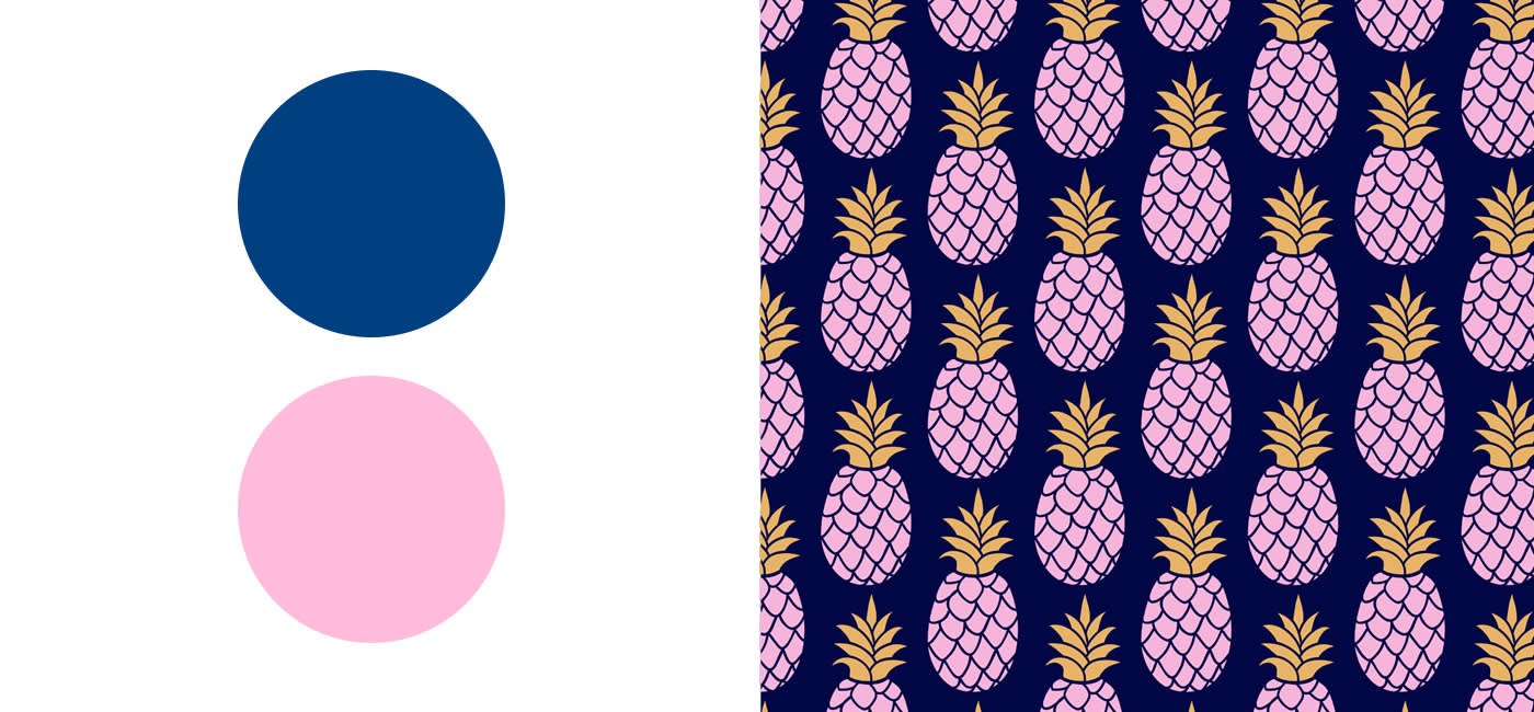
1. Blue and pink – make stereotypes history
As gender roles are shifting, it’s time to fold up the concepts of ‘boy and girl colours’ and throw them neatly into the recycling. Moving away from stereotypical combinations will also help you stand out.
Pink evokes feelings of spring and looks particularly nice in pastel aesthetics. Meanwhile blue is deemed a bit more mature. Combining them, like a pastel blue with a pinkish tone, or a darker blue with a light pink, is a great way of keeping it seasonal and tasteful.
Pink is also simply in trend this year. Head over to the Pantone Color Institute for the pink and blue combinations which could make your designs flourish.
Pastels and chill – in harmony
Certain blues give your designs a gentle and relaxing vibe, while pinks lend them a sense of playfulness and romance. Combine them for a calming and peaceful atmosphere.
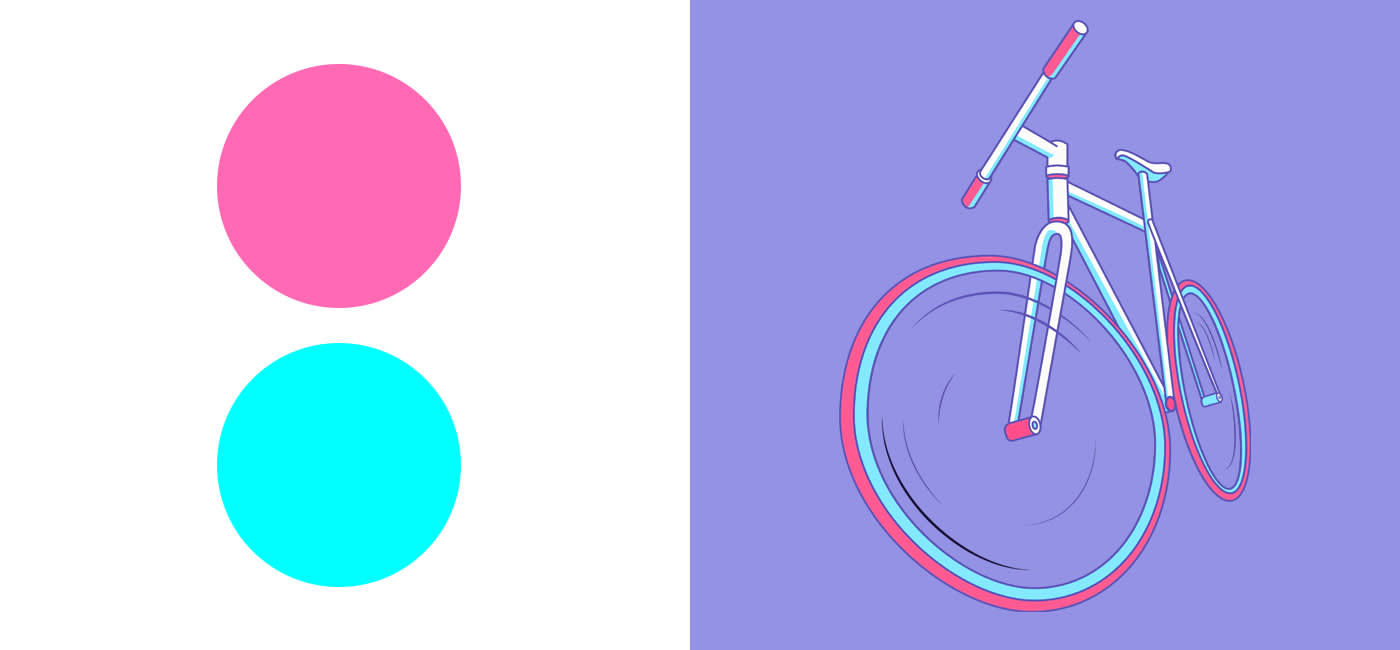
Hot pink & neon blue – the 90s never die
Less subtlety, more contrast. Glaring colours with geometrical shapes are your ticket for attention-grabbing 90s vibes. Throwback to a decade we all love to revisit time and time again.
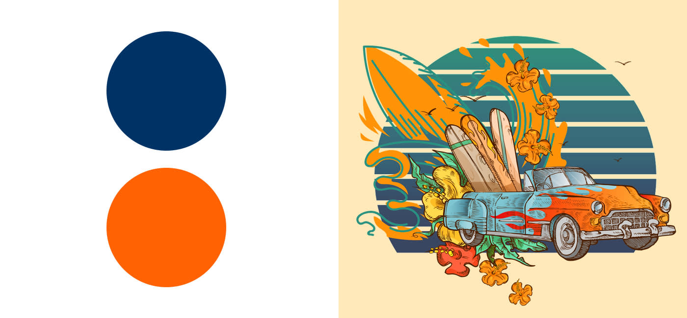
2. Blue & orange – freshen up
Blue and orange complement – and even strengthen – one another. Cute, right? In combination they are fresh and full of energy. If your design has a darker base you can throw in some contrast with this orange for example.
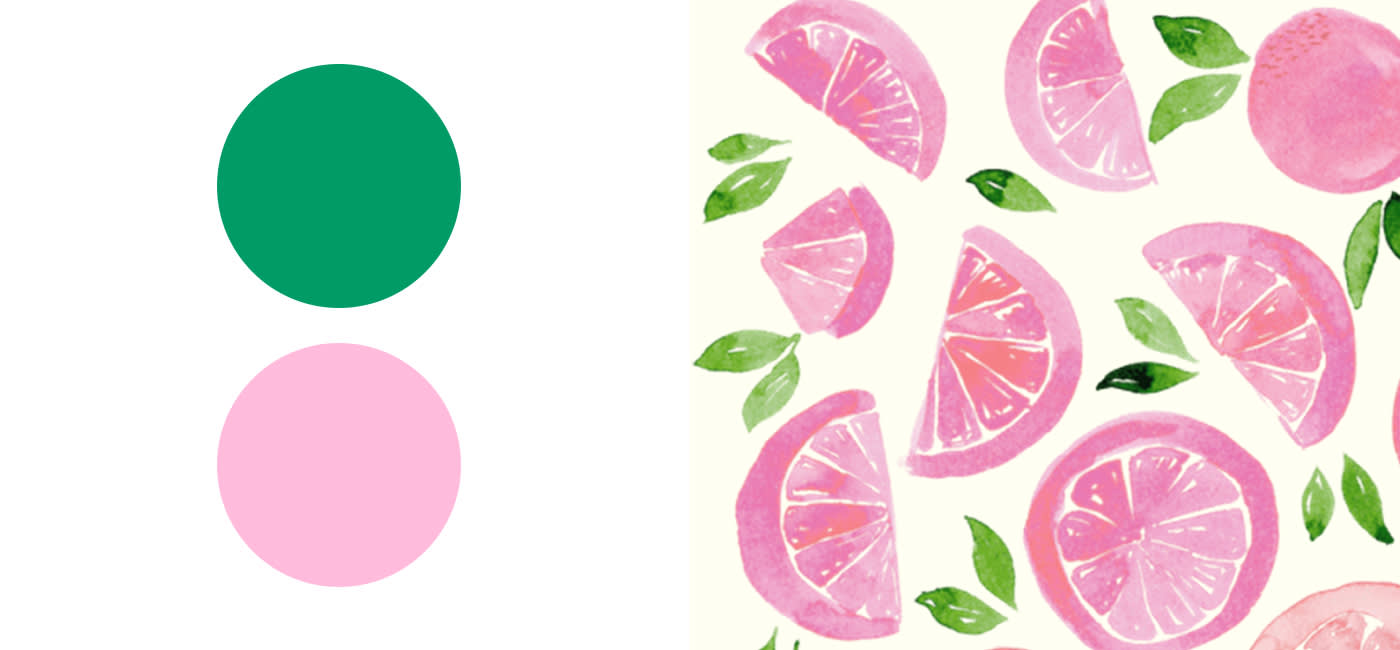
3. Green and pink – the perfect match
When trend meets trend. Green’s calming effects are juxtaposed perfectly by soft and romantic shades of pink.
This colour combo is particularly good for floral designs or anything evoking nature. With spring on our doorstep, see here how you can mix them in style:
Sea green and pastel pink, that’s amore
Use light and pastel green and pink tones for romantic sketches. Light shading infuses your designs with a zesty liveliness.
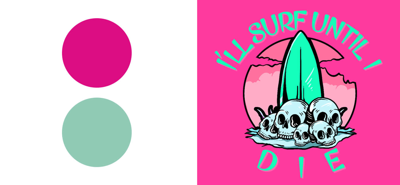
Cherry pink & teal – a dynamic duo
Time to get bright and powerful. As a vibrant tone, cherry pink is ideal for everything to do with love, romance and tenderness. Teal as the secondary colour transports the viewer to a place of water, nature and peace.
But it’s only dynamic when combined skilfully. Do so and you’ll channel a sense of playfulness, creativity, romance, love, spring and nature.
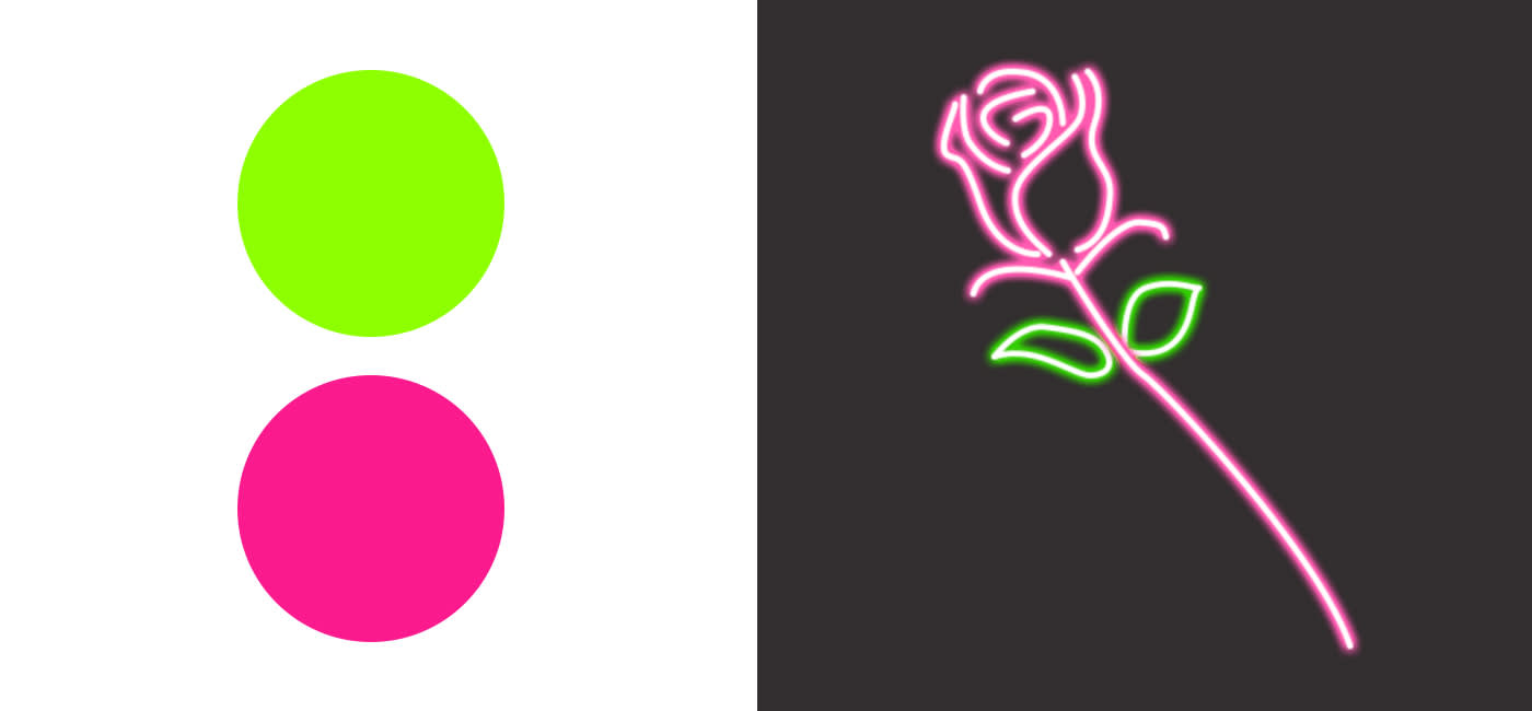
Fuchsia & neon green
Look for something a bit feistier? Then opt for a more audacious colour combination. A punchy mixture like fuchsia and neon green will get you noticed for all the right reasons.
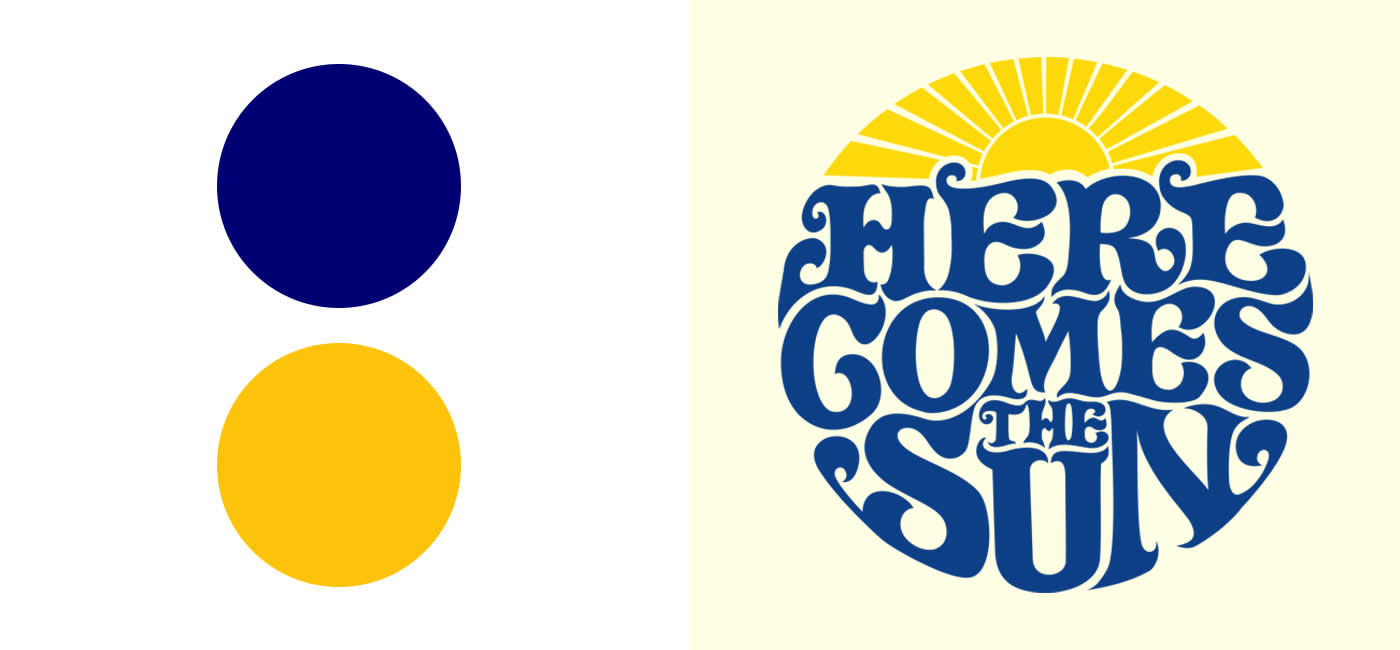
4. Yellow & blue – keeping it positive
On the topic of vibrancy, these two colours really let each other thrive. It works as a combo, whether with pastels or full-tone colours.
The connection made by a dark blue and a bold yellow results in a crisp contrast. Your designs will simultaneously beam out calmness and positivity.
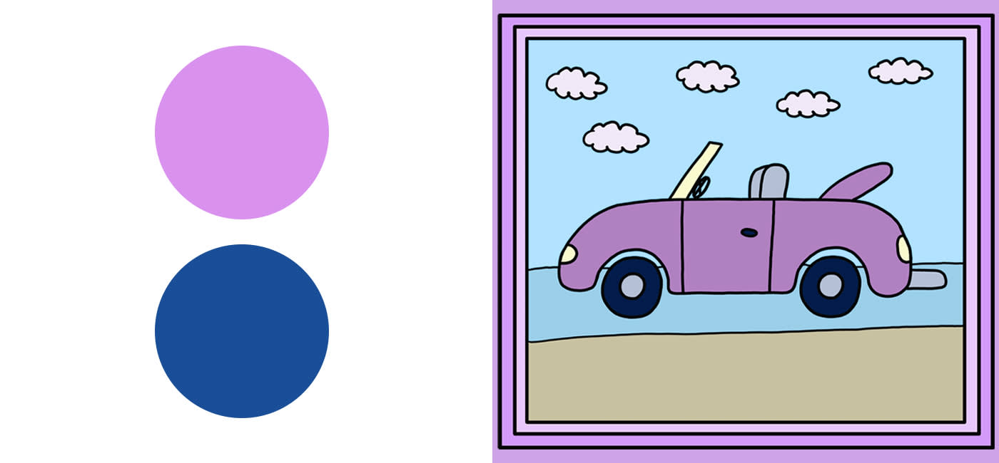
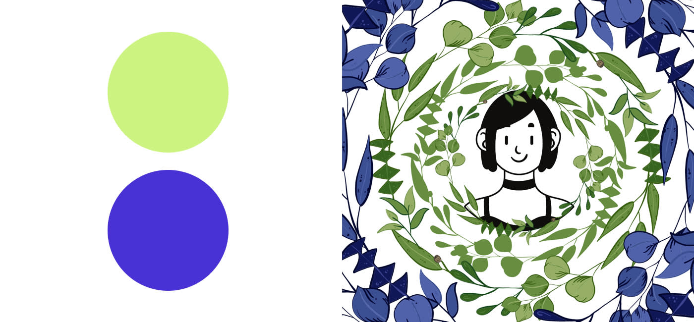
5. Lilac & blue – wake up and smell the flowers
This combination takes us more to a place a of tranquillity. Lilac and blue are natural colours which blend perfectly for a blissful aura.
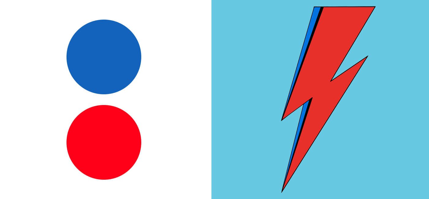
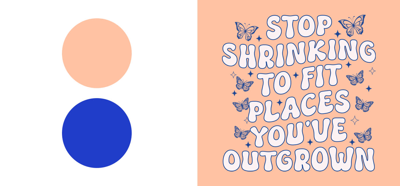
6. Blue & red – tried and tested
As primary colours, blue and red are always hanging around somewhere. When using this duo, employ other colours sparingly.
A deep blue in tandem with a warm red is a colour combination fit for all things retro, for example.
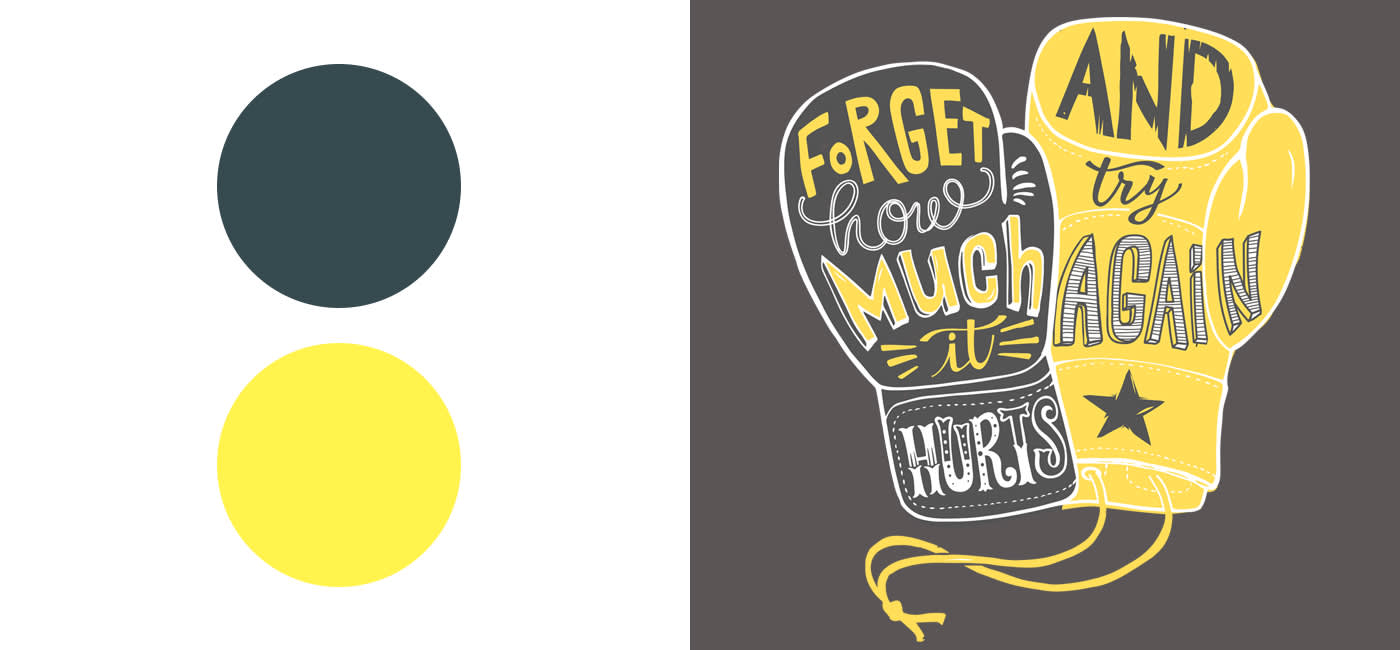
7. Anthracite & Lemon yellow – citrus & chalky?
Anthracites – a coal-like grey – combined with yellow is a certified winner. Any notions of the darkness or gloom of anthracite are perfectly combatted by the cheerfulness of a lemon yellow. Like rewarding a day’s work down a coalmine with a fruity soda.
8. We gonna rock down to, lime green and electric blue
These colours combined emit feelings of youthfulness and energy, making them a great starting point for modern, on-trend looks. Pantone Color Institute’s „Love Bird“ is the ideal candidate for this.
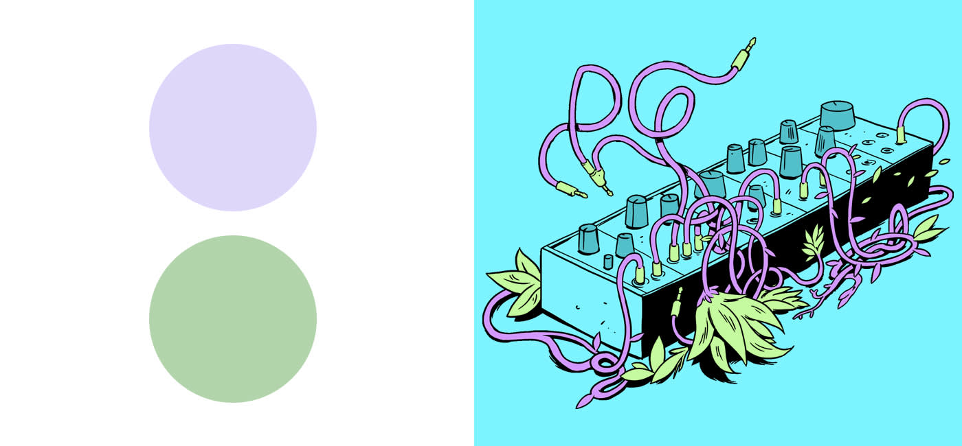
9. Smells like South France, lavender & green
Satisfying all your aesthetic needs. Stylish and subtle accents of lavender and green working together for perhaps the most elegant of our colour combinations. After you’ve booked a Mediterranean holiday, infuse this matchup into your designs.
10. Blue & peach – keeping it casual
Peach takes care of the warmth, blue the coolness. Together the colours produce a sense of harmony and balance. This mix will give your designs both elegance and serenity.
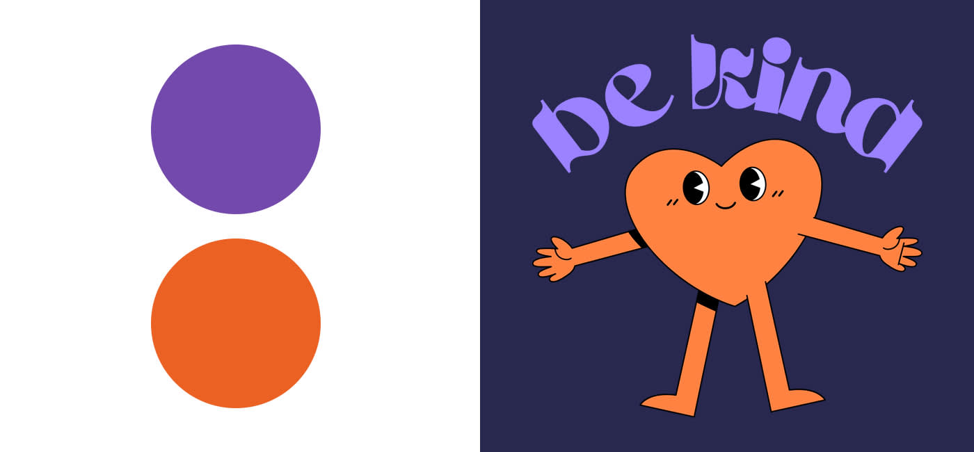
11. Purple & orange – attention please!
Purple or violet in combination with orange will get the people sitting up and looking. Powerful and garish, this devious duo appears in countless Halloween designs. Spo0o0oky!
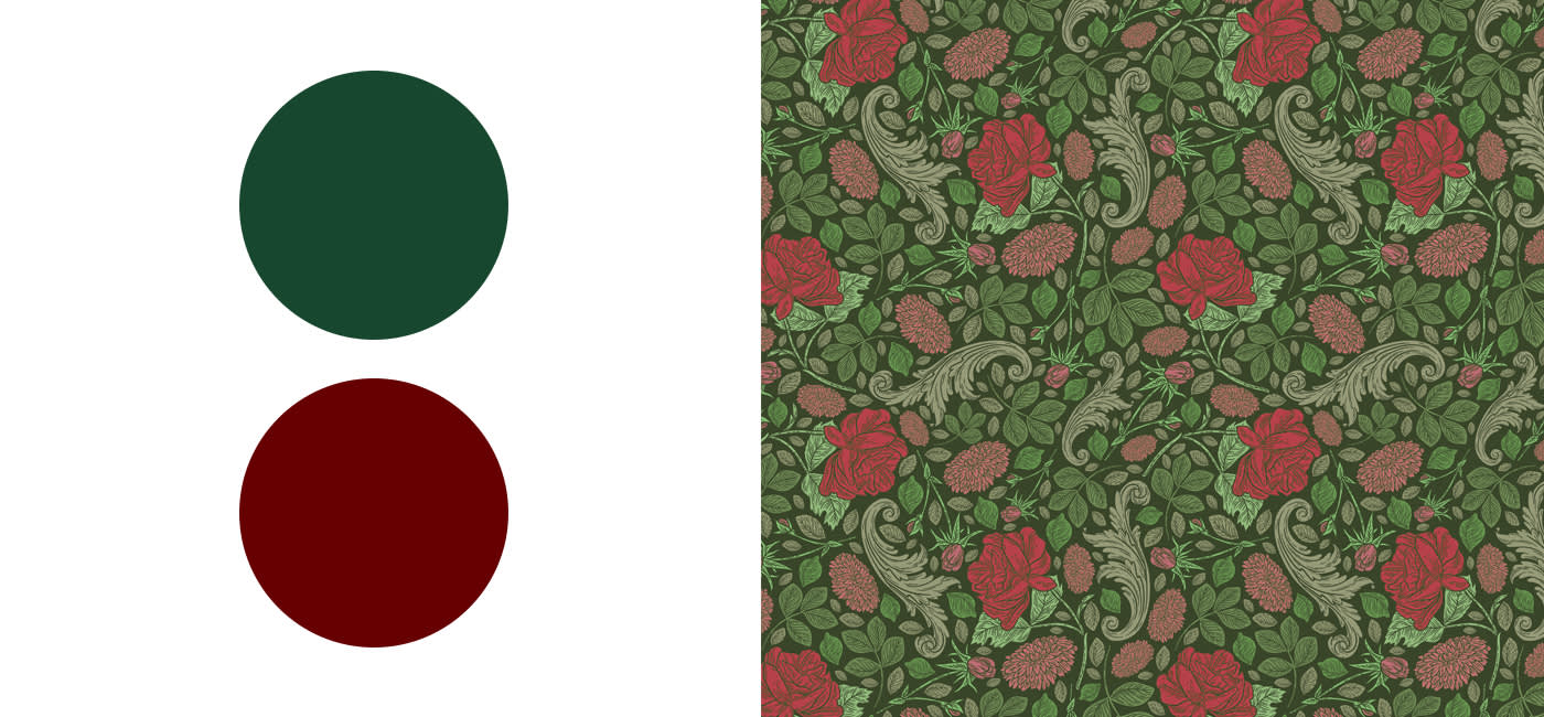
12. Red & green – how light do you want it?
Red and green can be signal colours even when you’re not waiting at the traffic lights. With these in combination, your designs will be grabbing the attention of learner drivers and, well, pretty much everyone else.
With darker tones of red and green work for a colour combo that is rather calming. Simple advice: the darker, the calmer.
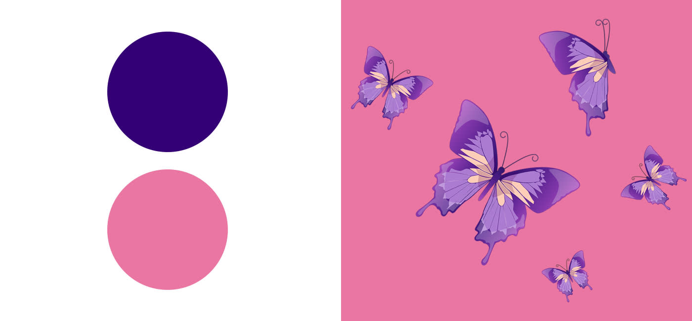
13. Violet & pink – keeping it in the family
Here, tones of the same colour family come together with similar tonal values. For you and me, that means brightness and darkness levels are closer together.
But even the closest knit families argue. With the on-trend combination of pink and violet, add the kind of harmony we all need into your designs.
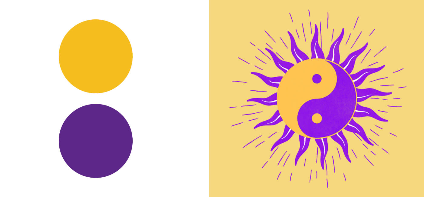
14. Yellow & purple – sublime contrast
While purple stands for the noble, mysterious and spiritual, yellow foregrounds freshness and brightness. With this contrast you’ll attract interest and pour gallons of energy into your designs.
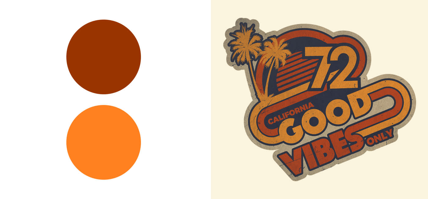
15. Owl play – brown & orange
Wood and earth – with brown tones your designs are rooted in nature. Orange opposes this by exuding energy and cheerfulness. In combination, they express stability and naturalness.
For autumnal themes, a colour combination of brown and orange is the ultimate founding block. They’re also a must for Halloween designs.
Something for everyone
Colour combinations are of course always a matter of taste. Our list is here to give your designs the final touch, as you know best which creations will be well received and which colours should be left in the paint tin.
Wanting to dive deeper in the world of colours? Then take a couple minutes to glance over our blog on inspiring colour schemes for your designs.
We wish you and colourful and artistic week!
The post 15 colour combinations you simply have to know appeared first on The US Spreadshirt Blog.
Looking for cool gifts? Check Rott515 store!