Welcome to Rott515
Your ultimate destination for all things design and t-shirt designing!
At Rott515.com, we believe that t-shirts are not just pieces of clothing; they are powerful mediums of self-expression, conveying messages, and showcasing personal style.
Our blog is a treasure trove of insightful articles, step-by-step tutorials, and industry insights that will fuel your passion for design and empower you to create eye-catching t-shirt designs.
Join our community of passionate designers, engage in discussions, and gain inspiration from fellow creatives. Whether you’re a seasoned designer or just starting your design journey, Rott515.com is your go-to resource for all things related to design and t-shirt designing.
We cover a wide range of topics, including:
- Design Techniques: Learn about various design techniques, such as typography, color theory, illustration, and graphic design principles.
- T-Shirt Design Inspiration: Discover a plethora of design inspiration from different genres, themes, and artistic styles.
- Printing and Production: Explore the technical aspects of t-shirt production, including printing methods, fabric selection, and sourcing.
- Branding and Marketing: Learn how to build your own brand as a t-shirt designer and effectively market your creations.
- Industry News and Events: Stay up-to-date with the latest trends, industry news, and events in the world of t-shirt design.
Get ready to unlock your creative potential, leave a lasting impression with your designs, and make your mark in the vibrant world of t-shirt design!
22/10/2024
Leverage the Future of Networking with Digital Business Cards
Digital business cards are no longer just about providing a business’s contact details. More than that, these cards…
17/10/2024
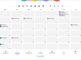
Most Important Occasions: October – December 2024
Great designs need to be matched up with great occasions. Our calendar tells…
15/10/2024
10 Outstanding Catering Business Ideas in 2025
Are you planning to start your own catering business? If yes, this is the…
08/10/2024
Unique Barber Logo Design Ideas for Modern Barbershops
A unique barber logo design is essential to marketing your skills as a barber.…
04/10/2024
8 Ways You Can Use Digital Cards for Your Business
Did you know that digital business cards are helpful for businesses of all…
01/10/2024
5 Product Label Design Tips to Attract Customers
Did you know that your product label design plays a catalytic role in driving…
30/09/2024
Adidas Logo History: How design reflects its brand identity
Adidas is a global company known for its high-quality sports shoes and…
27/09/2024
15 Unique Custom Halloween Gifts for Your Friends and Family
Spookiness is in the air! Take out your custom Halloween gifts to have a gala…
24/09/2024
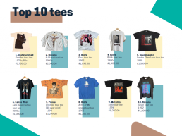
Rags to riches: The band tees in your closet that could be worth a fortune
Find out which band tees sitting at the bottom of your closet could…
23/09/2024
10 Reasons to Switch to Digital Business Cards for Networking
Contact sharing is now easier, thanks to digital business cards! These virtual…
20/09/2024
How to learn logo design for free
A logo design is an identity of its business. People see a logo to authenticate…
19/09/2024
Twitch Logo Evolution: Exploring History and Business Growth
The Twitch logo is among the most recognized designs, especially in online…
16/09/2024
How to Personalize MLS Gear for Game Day
Last updated on September 18th, 2024 Are you all pumped up to cheer for your…
16/09/2024
Your Ultimate Guide to Designing Personalized MLS Gear for Game Day
Are you all pumped up to cheer for your favorite team in Major League Soccer?…
14/09/2024
Creating and Changing Signature in Outlook on iPhone (2024)
Microsoft Outlook is a popular tool to send and receive emails. It comes along…
12/09/2024
US Presidential Election Logos & Slogans, 2024
With the US Presidential election set for 5 November 2024, many election logos…
11/09/2024
Free: Draw Your Custom Online Signature in minutes
With businesses going online, signing related documents electronically has…
09/09/2024
Top 13 Email Signature Examples: Designhill
What to include and what to avoid in your signature? These top email signature…
06/09/2024
The Ultimate Guide to Perfect Autumn Outfits for Family Photos
Autumn is the perfect season for choosing the best outfits for family photos.…
03/09/2024
Top 10 Script Fonts for Remarkable Logo and Branding
Script logos are making their presence felt thanks to their flowy look and…
30/08/2024
How to get a business license: A step-by-step guide
Starting a business requires you to get a license first. A business license…
28/08/2024
Dance Logo Ideas: Unique Logo Concepts for Dance Studios
A relevant dance logo for your studio is the first requisite to build a strong…
26/08/2024
Create Your Own Women’s Equality Day 2024 Statement Pieces
Women’s Equality Day is a reminder that women on all fronts are equal. They are…
23/08/2024
Create HTML iPhone Email Signature (in 2 mins): Designhill
Do you want to remove that no-so-professional “Sent from my iPhone” sign-off…
16/08/2024
Show your support for Harris or Trump with Spreadshirt
Tension is mounting as the 2024 US presidential elections are just around the…
14/08/2024
7up Logo Design – History, Meaning and Evolution
The 7up logo is amongst the iconic designs in the global food and beverage…
13/08/2024
Exploring Custom Options for Christian Wear
Spreading your belief through Christian wear is one of the best ideas. You can…
07/08/2024
How to Create HTML Email Signature in Minutes – Designhill
How do you create an HTML email signature generator that signifies your…
06/08/2024
What is Brand Reputation & why it matters: A handy guide
Did you know maintaining a positive brand reputation is important to grab…
01/08/2024
Expert Video Marketing Tips for Businesses of all Sizes
Video marketing is comparatively new to marketers compared to conventional…
30/07/2024
Exploring the history of the ChatGPT logo
The ChatGPT logo is one of the world’s most recognized visuals. We all look for…
25/07/2024
DTF vs. DTG: Which One is Better for Your T-shirt Business?
Starting a custom t-shirt business means considering the printing method, among…
24/07/2024
10 Small Business Ideas to Start from Home and How to Do It
What small home business ideas can you start quickly? People with skills often…
19/07/2024
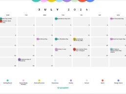
Upcoming Occasions July to September 2024
Great designs need to be matched up with great occasions. Our calendar tells…
19/07/2024
Discord PFP: How to Make Engaging Profile Pictures
Did you know creating stunning Discord PFP can boost your profile on the…
17/07/2024
How to promote your brand during the Paris Olympics with custom giveaways
With the Paris Olympics around the corner, brands have embraced themselves for…
13/07/2024
Exploring Samsung Logo and Its History
When it comes to minimalist logos, Samsung logo stands out. However, it was not…
11/07/2024
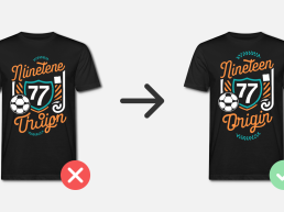
Your Guide to the Best 16 Brands for Custom Team T-Shirts
Do you want to boost team spirit? Design custom t-shirts to build a sense of…
04/07/2024
15 Famous Fast Food Logos and Their Meanings
Have you noticed famous fast food logos? Each one of them has a unique…
02/07/2024
How to start a mobile business: A Handy Guide
Planning to start a mobile business? It’s understandable that the rising rental…
29/06/2024
Essential Tips for Starting a Fashion Clothing Business
Last updated on July 1st, 2024 Do you have a passion for fashion? If yes, you…
28/06/2024
The Ultimate Guide to Choosing the Perfect Logo Type for Your Brand
A logo represents a brand in its target market. However, choosing the perfect…
24/06/2024
Design inspiration: summer, sun, dolce vita
🎵 La Dolce Vita! The sound of this summer: Five fresh summer design trends…
24/06/2024
The top 10 typography trends in 2024 for your designs
Are you looking for the perfect typeface for your designs? The current top 10…
22/06/2024
Spark Team Spirit with Exciting 4th of July Office Party Ideas
Last updated on June 26th, 2024 The 4th of July is around the corner, and your…
19/06/2024
Deliciously Memorable: Snack Logo Design Ideas to Make Your Brand Stand Out
Starting a snack business needs more than what pleases the taste buds. It…
14/06/2024
Copyright vs. Trademark vs. Patent: What’s The Difference?
Business owners with copyrights, patents, and trademarks for a particular…
13/06/2024
Tips to Design Logos for the Automotive and Car Industry
The automotive and car industry is highly competitive. Only a relevant…
12/06/2024
Fun and motivating shirts for jogging
Get ready to hit the streets in style as you prepare for your next big run Der…
11/06/2024
11 Creative delivery logo ideas and inspiration for your business
Are you planning to start your own delivery company? A delivery logo is what…
07/06/2024
AI and designs: dos & don’ts
Artificial intelligence, commonly referred to as AI, has become an integral…
07/06/2024
How-to: Legal information on the Olympic & Paralympic Games and UEFA EURO 2024
Major sporting events are the perfect occasion for your designs. Read more to…
06/06/2024
12 Stylish Outfit Ideas for Your Juneteenth Celebration
Last updated on June 11th, 2024 Are you ready with stylish outfit ideas for the…
05/06/2024
Shine bright like a 🌈 : Our Top 10 winners
Our Spreadshirt employees have voted – but you really didn't make it easy for…
05/06/2024
The Evolution of Discord Logo: A Journey through History
Last updated on June 7th, 2024 The Discord logo is among the most famous icons,…
03/06/2024
Top 10 Advantages of Choosing Printed T-Shirts for Your Big Events
When it comes to promotions, printed t-shirts are the most effective tool. Big…
28/05/2024
Congratulations to our proud top 20 🌈
It’s true: our design community is simply the best. Thank you so much for the…
28/05/2024
What are the Best Free Woodworking Design Software in 2024?
Woodworking takes time and effort to master. However, with the changing times,…
21/05/2024
5 Brand Pillars Every Business Needs to Know
Every business’s success depends on the brand pillars it chooses and…
21/05/2024
New label for official merch and branded products
The marketplace isn’t just home to creator designs — it’s also home to…
14/05/2024
Graduation Day Style Guide: Outfit Ideas for Every Family Member
The Graduation day is a huge moment for students and their parents. But what…
08/05/2024
A Guide to Printing Your Logo on Various Items
Last updated on May 27th, 2024 What’s the best way to advertise your business…
02/05/2024
Different types of packaging and why you need them
With different types of packaging available in the market, it’s quite…
29/04/2024
30 Of The Coolest Mother’s Day Gift Ideas
Mother’s Day allows us to show our mothers how special they are. For someone…
25/04/2024
The Ultimate Guide: Logo vs. Branding – What’s the Difference?
Every business has a logo, which we often call a branding logo. It’s the visual…
23/04/2024
Design Competition 2024 – Pride (LGBTQIA+)
Today’s the day we reveal the theme of the 2024 design competition &…
22/04/2024
5 Creative Logo Design Steps for Designers
Every logo design process takes time. There goes a lot more than what you see…
22/04/2024
Grab your pens, the 2024 Design Contest is here!
Who’s that knocking on your door? Could it be the first design contest of the…
19/04/2024
Dos & Don’ts for the design contest
The 2024 design competition is here, and we are on the hunt for the freshest…
19/04/2024
How to print a t-shirt: A handy guide
Last updated on April 23rd, 2024 T-shirts are versatile pieces. Printing your…
17/04/2024
How Color Psychology Works in Marketing and Branding
What do you feel when you see red, yellow, or blue colors? Color psychology has…
13/04/2024
Product design vs. packaging design: What’s the difference?
In the modern, highly competitive world, your product and packaging design must…
11/04/2024
Express Your American Spirit with Patriot’s Day Outfit Ideas
Short on Patriot’s Day outfit ideas? Stay with us, and we will share some of…
09/04/2024
Why and how to create a brand mascot for your business
Call it an avatar or spokesperson; a brand mascot is a hard-to-miss business…
05/04/2024
Lamborghini refreshes its logo design after decades
Did you pay attention to the new Lambo logo? Lamborghini — the luxury car…
02/04/2024
Most Important Occasions: April to June 2024
Great designs need to be matched up with great occasions. Our calendar tells…
02/04/2024
The Most Searched Terms April to June 2023
What have customers been searching for on the Spreadshirt Marketplace?…
02/04/2024
Disney Plus Changes its Logo Color to Refresh its Branding
Did you know Disney Plus changed its logo color to mark a new era in its…
01/04/2024
7 Expert Tips for Customizing Your Team’s Sports Uniforms
How do people recognize their sports team instantly? By looking at their sports…
30/03/2024
A Guide to Branding Package, Pricing & Inclusions
Last updated on June 27th, 2024 Your brand identity is the most crucial part…
29/03/2024
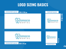
A guide to logo size for websites, social media, and print
Did you know the right logo size is essential for seamless branding?…
25/03/2024
Top 10 Creative Logos with Hidden Meanings
Businesses with creative logos build brand recognition faster. Since a logo is…
21/03/2024
How Customized Apparel Ignites Motivation for Working Out
When it comes to working out, we prefer apparel that is comfy and fashionable.…
18/03/2024
The FedEx Logo Meaning, History, and Evolution
Last updated on March 21st, 2024 Nobody ever thought that a logistics brand…
15/03/2024
“Free Shipping on Stickers” Templates
The post “Free Shipping on Stickers” Templates appeared first on Redbubble…
11/03/2024
The Perfect Outfit for the Total Solar Eclipse: Experience the Celestial Show in Style
Don't miss out on you chance to experience the total solar eclipse with a…
09/03/2024
Top 9 Free Alternatives to Adobe Photoshop for Creatives
The post Top 9 Free Alternatives to Adobe Photoshop for Creatives appeared…
20/02/2024
Color and Pattern trends for Spring/Summer 2024
Live life in colour, we’ll show you how! Let’s explore the colour, print, and…
20/02/2024
10 Graphic Design Trends you should know in 2024
New year, new trends. Immerse yourself in the dynamic world of graphic design…
07/02/2024
A Special Design for Our 17th Birthday
The post A Special Design for Our 17th Birthday appeared first on Redbubble…
05/02/2024
Your Product News for 2024
This post is entirely focused on new products or product updates for your…
18/01/2024
Most Important Occasions: January to March 2024
Great designs need to be matched up with great occasions. Our calendar tells…
15/01/2024
The Most Searched Terms January to March 2023
What have customers been searching for on the Spreadshirt Marketplace?…
15/01/2024
Patterns and predictions for 2024
Thoughts on what will have a lasting impact on us at the intersection of…
20/12/2023
A big thank you and recap of 2023
We’ve already made it to the end of 2023, and what an amazing year it has…
04/12/2023
SpreadApp 4.0 makes your Partner Area mobile
We’re willing to bet SpreadApp is set to become your new favourite app. After…
27/11/2023
Design trends for Christmas 2023
Red and white like a Santa hat, green like a Christmas tree, and sparkling…
27/11/2023
Order Deadlines for Christmas 2023
Get your designs under the tree in time: share our order deadlines on social…
21/11/2023
Pink Floyd Merchandise from Spreadshirt: The Long Wait is Over!
Want to share your passion for Pink Floyd with the world? What better way to…
20/11/2023
The changing role of design
It’s time to put creativity back into design again “Design has become a…
18/11/2023
Naruto Merch: The must-haves for every fan
Learn more about Naruto Uzumaki and his friends, and the fantastic official…
16/11/2023
Design a Movember outfit and promote better men’s health
Every year in November, the Movember movement takes place to raise awareness…
09/11/2023
The best graphic design challenges for training your creativity
As a designer, you face new challenges every single day. What’s the secret to…
09/11/2023
Design trends 2023/24 – fall and winter inspiration
It’s lovely and fresh out! Get comfy, grab a cup of hot cocoa and come this…
16/10/2023
Creative Halloween T-shirts for kids: a spooky guide for parents
Why self-designed Halloween t-shirts for kids are a real hit, what you should…
12/10/2023
Meet the Redbubble Artist Ambassadors
The post Meet the Redbubble Artist Ambassadors appeared first on Redbubble…
22/09/2023
Custom T-shirts for a Beer Festival
tips and advice for designing a Munich Beer Festival T-shirt. Learn how your…
19/09/2023
The Most Searched Terms October to December 2022
What have customers been searching for on the Spreadshirt Marketplace?…
19/09/2023
Most Important Occassions: October – December 2023
Great designs need to be matched up with great occasions. Our calendar tells…
12/09/2023
The cult of productivity
Is the decline of elitism of creativity inevitable? Image: “The cult of…
01/09/2023
When creatives quit
As creative managers, we take it personally when creatives quit. How should we…
27/08/2023
Seven traits of a good boss
There is no such thing as a perfect boss but these seven traits might help…
14/08/2023
Call for Artist Ambassadors: Help shape the future of Redbubble
The post Call for Artist Ambassadors: Help shape the future of Redbubble…
02/08/2023
Design Through the Decades: 90s Style
If you wanna be my lover… you gotta know the ins and outs of 90s designs and…
01/08/2023
In-Depth Guide to Vintage Design
Vintage design is a deep well of inspiration for designers. See how your…
24/07/2023
Branding yourself as a designer
Four steps for building our personal brands. Image: Midjourney “A herd of…
16/07/2023
A creative’s guide on starting a company
The seven laws for creative entrepreneurship I&CO’s first office (2016) I…
12/07/2023
Artist update: Search improvements and experiments
The post Artist update: Search improvements and experiments appeared first on…
12/07/2023
40-something creatives: What should we do next?
Five steps to help determine what we should do for the rest of our lives…
11/07/2023
Artist update: New tagging limits to reduce tag spam and improve relevance and conversion
The post Artist update: New tagging limits to reduce tag spam and improve…
06/07/2023
The single most important skill for a Chief Creative Officer
Creating an impact as a leader isn’t always about doing big things Image:…
05/07/2023
Puma Logo: History And Evolution Of The Iconic Design
The Puma logo is among the most iconic symbols in the world of sports apparel…
03/07/2023
Amazon Logo Decoding The Hidden Meaning, Evolution And History
Last updated on July 4th, 2023 Amazon is a leading multinational technology…
29/06/2023
Bestsellers from July to December 2022
Which products sold like the hottest cakes from July to December 2022? Find…
29/06/2023
Top Search Terms July to September 2022
What do customers search for on the Spreadshirt marketplace? Discover the top…
29/06/2023
Most Important Occassions: July – September 2023
There are always big occasions that call for big designs! Check out our…
29/06/2023
Wikipedia’s Subtle Makeover: A Fresh Look After A Decade
Wikipedia is a widely recognized online encyclopedia known for its up-to-date…
29/06/2023
The art of inquiry
Curiosity is ageless. Image: Alfred Aloushy “The question isn’t, ‘What’s the…
28/06/2023
Logo Design: The Perfect Number Of Versions You Should Send
A perfect logo design results from its designer’s skills and understanding of…
28/06/2023
AI Brings More Power To Ideas
Your Imagination Is Your Strenght Continue reading on Seeds For The Future……
26/06/2023
Chicago Bulls Logo: Unveiling The Fascinating Story
Logos are vital and core identities of the brands behind them. They serve as…
24/06/2023
Designing A Logo? Learn How To Avoid Overused, Generic Logos
When it comes to logo design, creating an original and distinctive design is…
20/06/2023
The Flash – Official Merchandise
Attention, fans of The Flash! We have some electrifying news for you. Our…
19/06/2023
20 Fonts to Bring the Nostalgia of the 90s
Last updated on June 23rd, 2023 Many retro styles are trending as consumers…
19/06/2023
Best Tutorial Sites and YouTube Channels to Level Up Your Design Skills
Are you eager to improve or acquire new skills in digital design and…
19/06/2023
Design by the decade – 80s graphic design style
The 1980s was an era of flamboyance, excess, and unapologetic self-expression.…
19/06/2023
Are creatives an endangered species?
The mechanism of evolution is natural selection. The evolution of creatives…
19/06/2023
The Standard Tier Explained: How Accounts Are Classified as Standard on Redbubble
The post The Standard Tier Explained: How Accounts Are Classified as Standard…
16/06/2023
10 Best AI Art Generators All Designers Can Use
Artificial Intelligence (AI) has become a norm today, embraced by businesses…
14/06/2023
Custom Clothing for Friendship Day: Your Bond with Pride!
Last updated on June 21st, 2023 Our friends are our unwavering support pillars,…
14/06/2023
Adobe Illustrator Has Entered The AI Game
A new AI-powered recoloring feature Continue reading on Seeds For The Future…
13/06/2023
The Mouse and the Cat
Apple’s Vision Pro & a lesson in strategy from an ancient Zodiac tale.…
12/06/2023
Porsche’s 75th Anniversary: Unveiling the New Logo in Celebration
Last updated on June 21st, 2023 The iconic luxury car manufacturer, Porsche,…
10/06/2023
How To Promote Business With Custom Patches
Last updated on July 4th, 2023 In today’s highly competitive business…
09/06/2023
How To Gather Graphic Design Requests Online
Last updated on June 12th, 2023 Gathering the perfect graphic design requests…
08/06/2023
How to Sell Your Designs in 5 Easy Steps
A good beginning doesn’t need to be hard. In 5 easy steps, we’ll show you how…
08/06/2023
Top 10 Electric Car Logos For Ideas And Inspiration
Last updated on June 19th, 2023 Experience the evolving landscape of roads as…
03/06/2023
The End of Brands as We Know Them
The End of Brands As We Know Them The evolution of brands and creativity in…
01/06/2023
Basic Tools & Equipment for illustrators
Have you written off pen and paper? Then these tools will help you make the…
01/06/2023
Designs through the decades: 70s style
Sit back, grab a snack, and discover the magic of wild 70's design styles.…
30/05/2023
How To Use AI Images to Ignite Creative Sparks
Experience the ever-increasing trend of using AI images in several business…
30/05/2023
Text In AI-Generated Images Just Got Better
Next step in generative AI Continue reading on Seeds For The Future »
27/05/2023
How To Find The Perfect Creative Agency
Last updated on June 1st, 2023 In today’s fiercely competitive market,…
24/05/2023
Supercharge Your Business Communication Through Effective Marketing & Networking Strategies
Last updated on June 27th, 2023 To enhance market reach, businesses must engage…
24/05/2023
The Ultimate Guide to T-Shirts
A comprehensive guide that showcases the versatility and appeal of our…
22/05/2023
15 Most Iconic TV Show Logos Of All Time
Beyond the engaging content, memorable characters, and enduring storylines, the…
20/05/2023
Be Yourself, Be Bold: Outfit Ideas For Standing Out In The Pride Parade
Last updated on May 25th, 2023 In June, Pride Parades take place worldwide,…
18/05/2023
How Business Insurance Protects Your Company: Essential Insights
Starting and running a business can be a challenging endeavor, as it involves…
17/05/2023
How Merchandising Can Make or Break a Movie
Learn how merchandise can build buzz and excitement for a movie or tv show,…
17/05/2023
How To Drive Customer Engagement with Inclusive Digital Marketing Tactics?
Last updated on May 31st, 2023 Businesses look for unique digital marketing…
15/05/2023
Was du von Premium-Künstler*innen lernen kannst
The post Was du von Premium-Künstler*innen lernen kannst appeared first on…
15/05/2023
How Custom Hats Can Help Your Business Stand Out
Last updated on June 12th, 2023 Hats have always been a popular fashion…
15/05/2023
Tipps zum Designen von Stickern
Designtipps für Sticker, die hängen bleiben The post Tipps zum Designen von…
13/05/2023
How Custom Outfits Can Boost Your Workplace Productivity
Last updated on May 15th, 2023 How you dress up in your workplace can…
10/05/2023
5 Premium Tier Artists You Can Learn From
The post 5 Premium Tier Artists You Can Learn From appeared first on Redbubble…
10/05/2023
4 Premium Tier Artists You Can Learn From
The post 4 Premium Tier Artists You Can Learn From appeared first on Redbubble…
10/05/2023
Celebrate The 4th of July with Patriotic Outfits
The 4th of July is a highly anticipated day for Americans to celebrate their…
09/05/2023
Top 12 Inspirational Magazines for Designers
Looking for inspiration for your next design project? Well, you can always ask…
09/05/2023
Celebrate Mom! 10 Creative Gift Ideas for Mother’s Day
With May 14th right around the corner, it’s high time to get in the mood for…
08/05/2023
55 Awesome Father’s Day Gift Ideas For 2023
Last updated on May 9th, 2023 With Father’s Day just around the corner, it is…
06/05/2023
51 Iconic Logos & Their Secret Significance
Last updated on June 14th, 2023 Logos are not just simple visual identities of…
05/05/2023
Amazing Updates to Midjourney AI
A new version 5.1 model + 3 new Niji styles Continue reading on Seeds For…
04/05/2023
21 Creative American University Logos For Inspiration [2023]
Last updated on May 5th, 2023 American universities are known for setting up…
04/05/2023
How To Design a Corporate Logo
A company logo that represents your brand and effectively communicates your…
03/05/2023
Passive Income on Medium?— April Earnings Report
Can you earn passively on Medium? Continue reading on Writers’ Blokke »
02/05/2023
The 21 Famous Brands With Numbers In Their Names You Can’t Ignore
Last updated on May 5th, 2023 Numbers have always been attractive to people and…
01/05/2023
Creativity Is a Privilege for the Wealthy. Or Is It?
Something not many are willing to say or admit Rei Inamoto and John Maeda at…
01/05/2023
From Sketch to Screen: 21 Must-Watch Documentaries For Graphic Designers
Last updated on June 24th, 2023 Whenever you’re stuck in a creative rut, you’ll…
30/04/2023
Design Unique Preakness Outfits: Bespoke Tips For Personalized Fashion
Last updated on May 12th, 2023 The Preakness Stakes is a popular horse-racing…
29/04/2023
21 Thoughtful Father’s Day Gift Ideas For Your Design-Loving Dad
Fathers are known not just for their masculinity but also for showering their…
27/04/2023
How ChatGPT Can Help Graphic Designers Supercharge Their Creative Process
Crafting compelling and unique designs that capture attention and inspire…
25/04/2023
Mastering Logo Design: The Art Of Choosing The Right Layout
Last updated on June 12th, 2023 Why do you create a logo? This tiny graphic is…
23/04/2023
21 Game-Changing AI Marketing Tools To Transform Your Strategies
Last updated on May 1st, 2023 Since more businesses compete in an ever-evolving…
21/04/2023
Unleashing The Versatility of Designhill’s 29 Logo Maker Tools For Your Brand
Last updated on May 16th, 2023 A logo is a crucial brand element visually…
20/04/2023
Top 10 Typography Trends for 2023 – Use the Right Font
Have something important to say, but not quite sure which font is perfect to…
20/04/2023
14 Free Color Tools for Designers
Colors, like features, follow the changes of the emotions. Feel like…
19/04/2023
Understanding how the new account fee may apply to you
The post Understanding how the new account fee may apply to you appeared first…
19/04/2023
How accounts are reviewed and classified
The post How accounts are reviewed and classified appeared first on Redbubble…
19/04/2023
We’re introducing new artist account tiers. Here’s why this will make Redbubble a better marketplace, and how the changes will apply to you.
The post We’re introducing new artist account tiers. Here’s why this will make…
19/04/2023
Possibilities and Limits of Generative AI According to a Novelist
One novelist’s experiment in pushing the limits of AI today A bike or a horse?…
12/04/2023
Quick Guide to what Sustainable Fashion Is all About
Sustainable fashion refers to the production, design, and consumption of…
09/04/2023
Rest in peace, Mr. Sakamoto.
A personal letter to the Japanese maestro and one of my role models Continue…
03/04/2023
Top US Startups to Watch at Global 2023
The Global Conference Startup Exhibition is just around the corner, and we…
03/04/2023
Top Europe Startup Exhibitors to watch for at Global 2023
This year, our Global Conference is featuring some of the top Europe-based…
03/04/2023
Design inspiration for April to June 2023
Sometimes great designs need to be matched up with great occasions. Our…
03/04/2023
Most Searched Terms – April to June 2022
What have customers been looking up on Spreadshirt Marketplace? Checking out…
03/04/2023
Your Trend Report: September 2022 – February 2023
Our trend report is here, showing you the products and colours about to drop…
03/04/2023
Creative Ways to Upcycle Old Mugs
Old, broken or otherwise useless mugs don’t necessarily need to be thrown…
30/03/2023
Top 31 SaaS Startups to Watch at Global 2023
Software as a service (SaaS) has transformed the way businesses operate, with…
28/03/2023
Top 17 Fintech Startups to Watch at Global 2023
Fintech is rapidly transforming the way we manage our money and do business.…
27/03/2023
To rebrand or not to rebrand?
When is the right time to rebrand? Almost never. But if you must, these…
22/03/2023
15 colour combinations you simply have to know
For pairings as iconic as mac and cheese, read on. Here is all you need to…
22/03/2023
Vibrant Colour Palettes Fit for a Painter
We’ve thrown together 8 of our favourite on-trend colour schemes. Use them for…
21/03/2023
Midlife crisis? Start a social sex revolution.
One woman’s crusade to normalize talking about sex. Continue reading on…
16/03/2023
One App to Solve Your Problems: SpreadApp BETA
Big news! With your SpreadApp you can now upload designs, create and publish…
14/03/2023
Top 17 AI Startups Exhibiting at Global 2023
Artificial intelligence is transforming the way we live and work, and the…
02/03/2023
Create Blog Is Back
After a short break (ahem – nearly two years) the Spreadshirt Create Blog is…
02/03/2023
Digital Direct Printing
As part of our series focusing on different print methods, and how they are…
02/03/2023
Why Print on Demand Clothing is Sustainable
Spreadshirt wants to help make the planet a greener place, read how Print on…
23/02/2023
Hottest T-Shirt Design Trends for 2023
New year, new design trends! To keep your creativity alive and boost your…
23/02/2023
Color Theory in Design: Putting it into Practice
Understanding the art of color is vital for designers who want to have the…
16/02/2023
Your Product News for 2023
This post is entirely focused on new products or product updates for your…
30/01/2023
Viva Magenta – Using the Colour of the Year
Both warming and cooling, uplifting and melancholic. There are many reasons…
30/01/2023
A celebration of colour – spring and summer design trends 2023
As the flowers begin to bloom, it’s time to start dreaming of the warmth and…
04/01/2023
New Design Price Structure for Your Marketplace Sales
As of February 1st, there will be only one design price for each product…
02/01/2023
Most Important Occasions: January – March 2023
Holiday season may be over, but next year has even more occasions to match up…
02/01/2023
Top Search Terms January to March 2022
What did customers search for on Spreadshirt’s Marketplace? Discover the top…
02/01/2023
Bestsellers: January to June 2022
Know your audience‘. Just because some sayings are overused, doesn’t mean they…
16/12/2022
Looking back at 2022: Another wild one
What a year! War in Ukraine, an energy crisis, recession and inflation. 2022…
16/12/2022
Inspiration: How to Gift Designers
Driving home for Christmas and needing a creative gift idea for your even-more…
16/12/2022
Top 10 Inspiring Books for Graphic Designers
When was the last time you gave yourself a gift? In our top 10 most inspiring…
14/12/2022
7 Steps In Product Packaging Design Every Designer Should Know
Selling a new product in the market requires unique marketing strategies. But…
10/12/2022
15 Stylish Winter Clothes You Can Customize To Up Your Fashion Game
Last updated on December 12th, 2022 Do you love custom clothes? Well, winter…
07/12/2022
How To Choose The Right Logo File Format? A Complete Guide
A logo is the core identity of a brand. If its design is unique and simple,…
03/12/2022
Icon Design Trends You Shouldn’t Miss Out
Icons are everywhere in the physical and digital world today. These smaller…
30/11/2022
13 Proven Customer Retention Strategies For SaaS Companies In 2023
Last updated on December 1st, 2022 Retaining a customer is more advantageous…
26/11/2022
Tips To Protect Your Logo Trademark From Infringement
Unquestionably, a logo is the most significant identity of any brand. This is…
25/11/2022
Design Trends for Christmas 2022
‘It’s the same every year’. We are not so sure. Christmas may have its…
25/11/2022
Christmas Inspiration for your Designs
Last Christmas on instant repeat? Your dancing Santa moves causing a slight…
25/11/2022
Order Deadlines for Christmas 2022
Your designs on our products are the perfect pairing for Christmas gifts – we…
23/11/2022
Why Does Your Brand Need Customized Branding Visuals?
Brands convey a message to their target audience through a variety of visuals.…
17/11/2022
Handling Customer Complaints: A Complete Guide
A solid customer base matters the most for the steady growth of a business. But…
12/11/2022
How To Celebrate Thanksgiving – A Comprehensive Guide
Last updated on November 25th, 2022 Festivals and holidays are there to bring…
08/11/2022
Reebok Logo: Decoding History and Evolution
Reebok is among the leading global fitness brands. Its iconic logo is now a…
05/11/2022
8 Best Email Templates For Small Businesses
Last updated on November 14th, 2022 Email marketing is a powerful tool for…
02/11/2022
10 Christmas Shirt Ideas to Get You Into the Christmas Fever
Last updated on November 11th, 2022 Christmas is a festive occasion everyone…
30/10/2022
What Is UX Design & How Can You Become A UX Designer?
Last updated on November 16th, 2022 Just a decade ago, no one was talking about…
27/10/2022
Football (Soccer) World Cup 2022 – Info on Trademarked Brands
Feeling it’s time to kick a bit of world cup fever into your Shop? Great idea,…
27/10/2022
What is Word-of-Mouth Marketing and how can you master it?
Last updated on November 23rd, 2022 Many more consumers believe in those…
24/10/2022
How To Make A Great Moodboard? Learn In 5 Easy Steps
Last updated on December 7th, 2022 Creative people and strategists look for new…
21/10/2022
What Is UI Design & How It Helps Build A Better App & Website?
Last updated on November 29th, 2022 There are thousands of websites in any…
18/10/2022
Wireframe vs. Mockup vs. Prototype: Decoding The Differences
Last updated on November 25th, 2022 Designing is a complicated process that can…
16/10/2022
Top 11 Trending Logo Techniques For 2023
Last updated on December 15th, 2022 It is not that logo design trends are going…
15/10/2022
Will Responsive Design Overpower Pixel Perfect Designs In 2023
Last updated on December 15th, 2022 Several techies strongly believe that this…
14/10/2022
Top 100 Free Fonts For Designers For 2023
Last updated on December 15th, 2022 Fonts play a vital role in bringing any…
13/10/2022
T-Shirt Design Trends To Look Out For In 2023
Last updated on December 15th, 2022 T-shirts have proved their worth when it…
12/10/2022
Top 15 Freelance Stationery Designers For Hire In 2023
Last updated on December 15th, 2022 Designs play a vital role in the stationery…
11/10/2022
Top 10 Free Brochure Maker Tools To Design Custom Brochures In 2023
Last updated on December 14th, 2022 Even if the digital revolution is ruling…
10/10/2022
FIFA World Cup 2022 Logo Design: Everything You Need To Know
Last updated on October 20th, 2022 The FIFA World Cup 2022 is all set to…
10/10/2022
Top 5 Free Album Cover Maker Tools In 2023
Last updated on December 14th, 2022 An album cover generally represents the…
09/10/2022
Top 10 Off-Page SEO Strategies For Startups In 2023
Last updated on December 14th, 2022 So you’re at the helm of a startup and are…
08/10/2022
Top 6 Online Cover Letter Generator Tools For 2023
Last updated on December 13th, 2022 A good cover letter helps you leave a good…
07/10/2022
Top Instagram Accounts Designers Should Follow
We dove into the depths of Instagram and resurfaced with some highly…
07/10/2022
Top 8 Community Platforms for Designers
Cross-pollination gives life to a new flower with pollen from another flower.…
07/10/2022
Top 10 Education Logo Trends In 2023
Last updated on December 13th, 2022 There are many educational institutions in…
06/10/2022
T20 World Cup 2022: A Look Into Teams’ New Jersey Design
The much-awaited ICC Men’s T20 World Cup 2022 (earlier known as ICC World…
06/10/2022
Submit Your Creations to the Fan Art Program
The post Submit Your Creations to the Fan Art Program appeared first on…
06/10/2022
Top 5 Free Flyer Maker Tools In 2023
Last updated on December 13th, 2022 Flyers are one of the most cost-effective…
05/10/2022
40 Startups to Watch at The Upside of Downturns Summit
The Upside of Downturns Summit will bring together thousands of startup teams…
05/10/2022
Top 12 Small Business Tools You Must Use In 2023
Last updated on December 13th, 2022 Starting a business is perhaps easy but to…
04/10/2022
Top 7 Logo Trends To Stand Out In 2023
Last updated on December 12th, 2022 Logos are important to visually communicate…
03/10/2022
Top 7 Reasons Why Visual Content Will Dominate In 2023
Last updated on December 12th, 2022 Interactive content helps businesses…
02/10/2022
Top 10 Book Cover Design Trends For 2023
Last updated on December 12th, 2022 Books are the greatest source of useful…
01/10/2022
5 Free Online Infographic Maker Tools In 2023
Last updated on December 8th, 2022 Infographic maker tools let you present tons…
01/10/2022
51 Most Iconic Movie Posters of All Time That You Shouldn’t Miss Out
Last updated on October 3rd, 2022 Movies are a great source of entertainment,…
30/09/2022
17 Emerging Graphic Brand Identity Trends For 2023
Last updated on December 7th, 2022 Life is changing rapidly, and the new world…
29/09/2022
This Season’s Special Occasions: October to December 2022
Events are always a good occasion for new designs. Our calendar will give you…
29/09/2022
Your Trend Report – March to August 2022
The trend report is here to show you the products and colours which could be…
29/09/2022
The Most Searched Terms October to December 2021
What have customers been searching for on the Spreadshirt Marketplace?…
29/09/2022
Inspiring Design Trends for Fall and Winter 22/23
The leaves are changing, temperatures are falling, and the smell of pumpkin…
29/09/2022
7 Game Of Thrones-Inspired Logo Symbols You Can Use For Your Brand
Have you ever paid any attention to the sigils that appeared in Game of…
29/08/2022
New Pet Bowls: Essential Design Tips for Products That Sell
The post New Pet Bowls: Essential Design Tips for Products That Sell appeared…
02/08/2022
Startup Spotlight Q&A: Welivery
Last-mile delivery is a huge market right now, and amazing startups around…
18/07/2022
Coming Soon: New Bucket Hats!
The post Coming Soon: New Bucket Hats! appeared first on Redbubble Blog.
01/06/2022
4 Scaleups We Met Last Month
Last month, Startup Grind hosted the Global Conference in Redwood City. It…
09/05/2022
New Pet Products are Coming Soon. Get Your Shop Ready for Launch!
The post New Pet Products are Coming Soon. Get Your Shop Ready for Launch!…
21/04/2022
Custom Stickers Are Go!
Whilst we might not have posted something in a little while, we've still been…
19/04/2022
How to stand out with a great domain name?
How to stand out with a great domain name Showcasing your great idea with a…
15/12/2021
10 Last-Minute Christmas Gifts That Don’t Feel Last-Minute
The holiday season is very much upon us, and you’re still stuck on a special…
29/11/2021
December Yearly Artist Payment | Check Your Payment Details
The post December Yearly Artist Payment | Check Your Payment Details appeared…
22/10/2021
Popular Products for the 2021 Holiday Season
The post Popular Products for the 2021 Holiday Season appeared first on…
22/10/2021
Using the Bulk Editing Tools to Add and Configure Products
The post Using the Bulk Editing Tools to Add and Configure Products appeared…
04/10/2021
Getting to Know Our Neighbours
The post Getting to Know Our Neighbours appeared first on Redbubble Blog.
07/09/2021
Fall Design Ideas to Keep You Warm
Fall at last! You could say it’s the April among the seasons with all of its…
21/08/2021
5 Gift Ideas that Virgos Will Love
Virgos are born between August 23 and September 22. They’re practical people…
16/08/2021
Introducing Mouse Pads and Desk Mats
The post Introducing Mouse Pads and Desk Mats appeared first on Redbubble…
22/06/2021
The Fascination with Soccer – a Psychological View on Sport
What is the fascination with soccer from a psychological point of view, and…
17/06/2021
Your Wedding, Your Way
Are you planning your big day? Here’s how to make sure your celebration feels…
11/06/2021
European Soccer Culture and the Championship
We’re taking a look at why Europeans are obsessed with soccer, and why Denmark…
25/05/2021
5 Gemini Gifts for Zodiac Fans
Looking for a custom zodiac gift? Find inspiring tips for custom gifts for…
07/05/2021
Live-Work Space in Your Home Office
Creating your own live-work space can be easily done by decluttering a room…
03/05/2021
The right print for your business: digital printing
You'll find the right print type for every purpose and application at…
04/05/2020
The Art of Letting Go
Selling an original work of art (no matter the cost) is a validating moment in…
04/05/2020
How To Sell Art Online
Fine Art America is the world’s largest online art marketplace and…
01/05/2019
‘Tis the Season for Graduation Gifts
[et_pb_section bb_built=”1″ fullwidth=”on” _builder_version=”3.0.47″…






























![21 Creative American University Logos For Inspiration [2023] 21 Creative American University Logos For Inspiration [2023]](https://rott515.com/wp-content/uploads/2023/07/Resize-Banner_0020_-Harvard-uai-258x193.jpg)

