Looking for cool gifts? Check Rott515 store!
Beyond the engaging content, memorable characters, and enduring storylines, the logos of popular TV shows hold a significant place in their success. This collection of iconic TV show logos invites you to explore the significant impact of incredible design and aesthetics on their overall appearance, contributing to the show’s success.
Do you love TV shows? I bet you do. A great TV show has everything in sync with its content. Right from its title to its story, characters, dialogues, and costumes, everything looks perfect. But the most powerful element is its title logo which gets us hooked.
Mere a glance at TV show logos like “The Game of Thrones,” “Breaking Bad,” “Friends”, and more is enough to understand its theme and message. The logos of these TV shows have become a massive hit among the audience.
But have you ever wondered what makes them so remarkable? Their color concept, story, imagery, and typography are the answer. So let’s look at those iconic TV show logos of all time and the concept behind their specific designs.
The 15 Most Iconic TV Show Logos Of All Time
01. Game of Thrones
Our list starts with Game of Thrones — one of the most epic shows in the history of TV series. Its logo is perhaps the most recognizable visual asset. The essence of the whole show lies in its title sequence, designed by three different teams.
While its design was created by Elastic, its computer graphics were done by a52, and the editing was completed by Rock Paper Scissors.
Let’s look closely into its logo design. The Game of Thrones title sequence features a Trajan Pro font resembling the original Roman typeface. The logo of the TV show includes a wordmark that looks strong and perfectly aligned in the center. The ‘O’ letter in the title has three vertical lines inside its circle. The elongated horizontal bar of the ‘T’ ends at the last letter ‘S’.

The name of the TV show is written in upper-case with the initials ‘G’ and ‘T’ enlarged and the ‘of’ element reduced. The title sequence comes against a complex circular badge (showcasing all the legendary houses of the show) centered on a rectangle.
The badge showcases four animals’ heads placed in four different directions. These include — Direwolf, which portrays House Stark, Lion, which showcases House Lannister, Dragon, which stands for House Targaryen and Deer, which symbolizes House Baratheon.
What’s more? The Game of Thrones logo gives a clue about the show itself.
02. Stranger Things
What started in 2016 is now a super-hit pop-culture TV show set in the 80’s era. Yes, we’re talking about Stranger Things. Besides its story and effects, the TV show’s logo is one of the most talked about things today.

The logo is the ultimate creation of Jacob Boghosian, who drew logo design ideas and inspiration from Stephen King’s book covers and movie posters. While making the logo of Stranger Things, he created over twenty logos, but he and his team decided to go with the one featuring the ITC Benguiat font.
Jacob and the team later modified the font to make it more attractive and unique. It looks one of a kind and perfectly matches the theme of the show.
Looking For a Logo Design?
We have helped thousands of business owners from all around the world with their graphic design needs such as a logo design, website design, social media posts, banner design and much more.
Get Your Logo Design Create Your Own Logo Online
03. F.R.I.E.N.D.S
Who can forget the F.R.I.E.N.D.S logo? It is unquestionably one of the most iconic TV show logos ever. This 90’s famous TV series features six dots in between the letters portraying the show’s six main characters.

When you look closely, the six dots are the same colors as the umbrellas in its title track. Six friends, six colors, and six dots; everything is symbolic in this famous TV show logo.
04. The Walking Dead
You’ll find an interesting twist when you pay attention to the Walking Dead logo. It keeps on decaying with each season aired.

The finale that aired on 20th November 2022 showcases a more bloodied-and-faded logo symbolizing the theme of the series. A look at every season’s logo will clear out all your doubts.
05. Breaking Bad
Who can forget the TV series — Breaking Bad? The name itself stands for its theme and plot. And a look at its logo, which is subtly clever, gives an idea of what the whole show is about. It’s one of the most popular TV show logos that has created an enormous fan base worldwide.

The show revolves around a chemistry teacher becoming a drug (methamphetamine) supplier who chose this path to afford his cancer treatment.
The typographic logo has two significant elements, bromine (Br) and barium (Ba), in its title. Whoever has featured it in this show’s title must have been brilliant. A smart move to use chemistry elements to form a TV show title.
06. Narcos
Narcos is yet another typographic logo. The TV show is based on the life of the drug lord Pablo Escobar. The name is displayed in Akzidenz Grotesk Condensed font that features gentle curves at the leg of R. This delicate contrast highlights the character of Pablo.

07. The Office
This funny workplace comedy show has a pretty simple logo. It features the logo in typographic format showcasing all the letters in lowercase. Seeing the logo gives a feel that it’s been typed using a typewriter. That’s the subtle connection hinting at the plot of the show.

As the logo is simple and can easily be transformed into any color, you get the idea that the show is sweet and simple; and portrays all the things that happen in an office.
08. American Horror Story
Can typography be creepy? Yes, the typography used in the American Horror Story show sends chills down the spinal cord. The font takes its references from the handwriting of Charles Rennie Mackintosh. Mackintosh was a chief representative of the international style of art — Art Nouveau.

Though Art Nouveau is considered decorative and cheerful, its application in a thriller context changes the whole scenario. It can be eerie in its natural art form.
Recommended Reading:
09. Squid Game
Squid Game — the Korean series on Netflix took the whole world by storm. Everything related to this show got popular, including its thrilling plot, squid game symbols, and of course, logo.

This mysterious survival game series’ concept originated from kids’ popular games. Its logo showcases geometric shapes with pink and white text. The background is black, which references its dark plot.
Its original logo showcases alphabets arrange at a certain level. On the other hand, the English version of the Squid Game logo features linear text that helps it stick to its original concept.
10. Full House
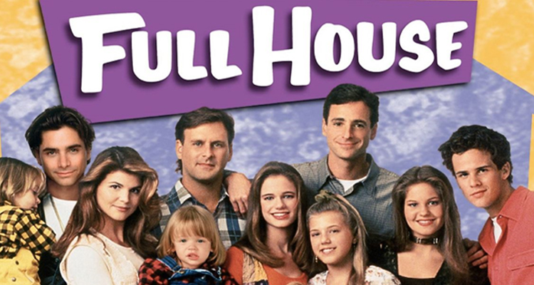
The Full House series depicts one of the 90’s famous TV show logos. Its logo is pretty simple. The letters appear in uppercase but in a hand-written font for wholesomeness.

This typography matches well with the characters of the show. Even its spinoff has the same font adding to its popularity.
11. Vikings
The show is based on a medieval theme with an excellent logo in every aspect. It showcases a V mark, with one side displaying an intricate design and the other plain. While the intricate design (left side) portrays a softer aspect of the Viking culture, the plain design (right) depicts violence and war.

12. Mad Men
It’s rare to see a human silhouette used in a logo, but Mad Men’s logo portrays a man smoking a cigarette with his back resting upon the letter mark. The image of the man represents Don Draper, the series’ main protagonist. The use of black, white, and red colors complements the story.

Recommended Reading:
13. Lizzie McGuire
Lizzie McGuire’s show has a huge fan following, known for its main character facing social and personal issues during the teenage years and its well-designed logo. The logo showcases a cartoon version of Lizzie McGuire alongside funky typography depicting the show’s name.

A single glance at this logo gives a clue about its plot. The use of bright colors exhibits its playfulness and youthfulness.
14. Orange is The New Black
This show features a morally conflicted character facing prison, stepping into a new role. The logo incorporates black and orange colors that personify Piper, the show’s lead character.

On closer inspection, you’ll notice two black bars on each side of the logo, representing the bars of a jail. The letters are unfinished to signify the growth people experience throughout their lives.
15. The X Files
The X-Files TV show holds a special place in the hearts of those who grew up in the 90s. Its logo, combined with the ominous music, triggers a sense of mystery.

The show is one of the best TV series in television history, having won its first Emmy in 1994, thanks to its incredible graphic design and title sequences. The logo showcases the Industria font, with FF Trixie font used in the background ‘X’.
Conclusion
Watching TV shows with remarkable logos that carry meaningful themes is incredible. Each logo represents a subtle or clear theme that further enhances the story of the show. Different elements, colors, and fonts make these logo designs stand out.

