Understanding the art of color is vital for designers who want to have the biggest effect with their designs. Color attracts attention and transports thoughts, feelings, and moods in ways that are not possible through any other medium.
Color is usually the first thing that people remember when they are asked to describe an image or design – which makes it a key element in design creation. You can use color to direct the viewer’s eye, focus their attention, or succinctly transmit information.
All of this makes it super beneficial for any designer to know a little bit about the theory behind it. If you know how different color systems work, you can use them in a more meaningful way to give your designs that special touch.
What is the color wheel?
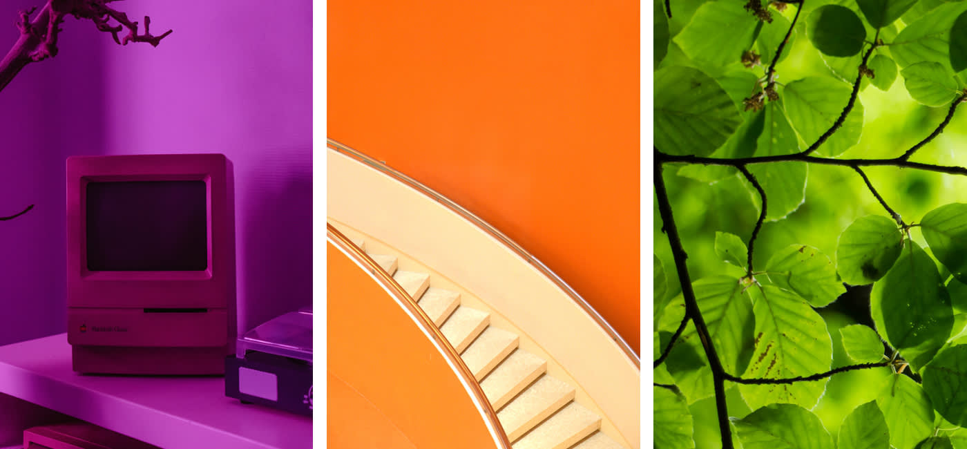
Red is red is red – or is it? In truth, there are countless nuances and gradations of red; vermillion, blood red, rose red, terracotta red, scarlet, etc. The same thing is true of all colors, in their infinite and beautiful variations. To organize and order all these colors, designers use the color wheel.
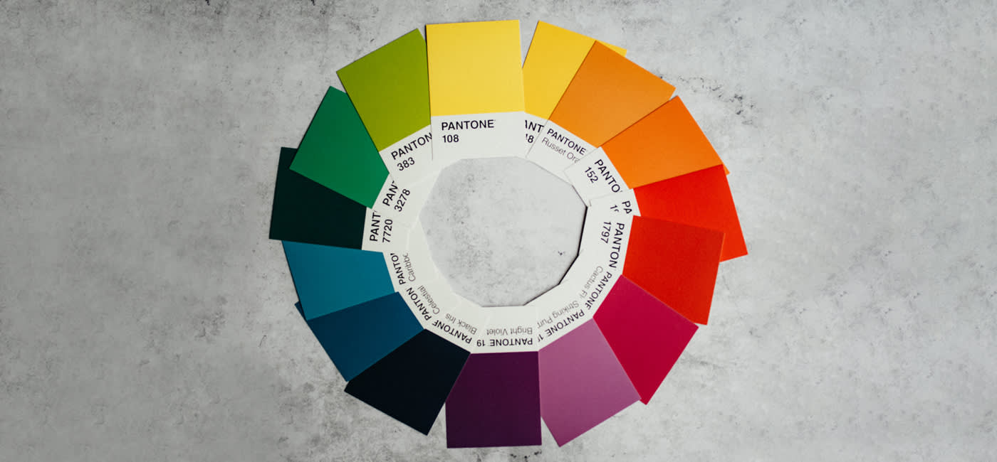
A color wheel is a circular representation of the color spectrum. It is used to make connections between the colors clear and to be able to separate and grade different color tones. It can also be very useful in selecting shades and building color schemes for a specific project.
The color wheel consists of primary, secondary, and tertiary colors:
- Primary colors are the basic colors that can’t be made by mixing any others. These are yellow, red, and blue.
- Secondary colors are colors made by mixing two primary colors – orange, green, and purple
- Tertiary colors are colors that you get by mixing primary colors with secondary colors. These include magenta, vermillion, violet, teal, amber, and chartreuse.
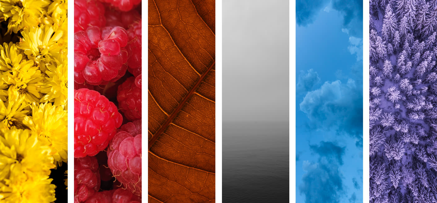
What are warm, cool, and neutral colors?
Colors can also be categorized by their temperature. Colors overall can be said to be either warm, cool, or neutral colors, as can shades or tones within each color spectrum. These color temperatures can help you build feelings or moods in your designs to give context to the detail.
Warm colors, for example, create optimism and excitement, while cool colors radiate peace, tranquility, and harmony.
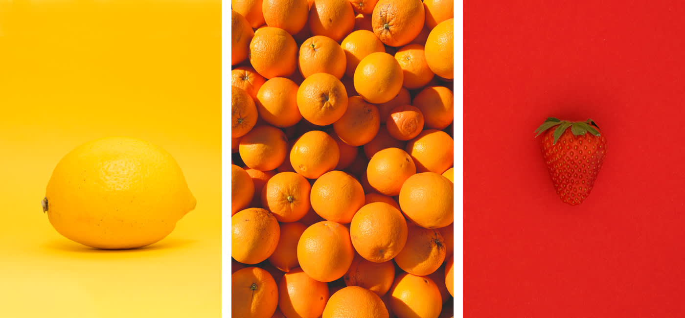
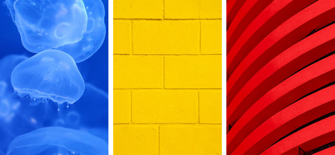
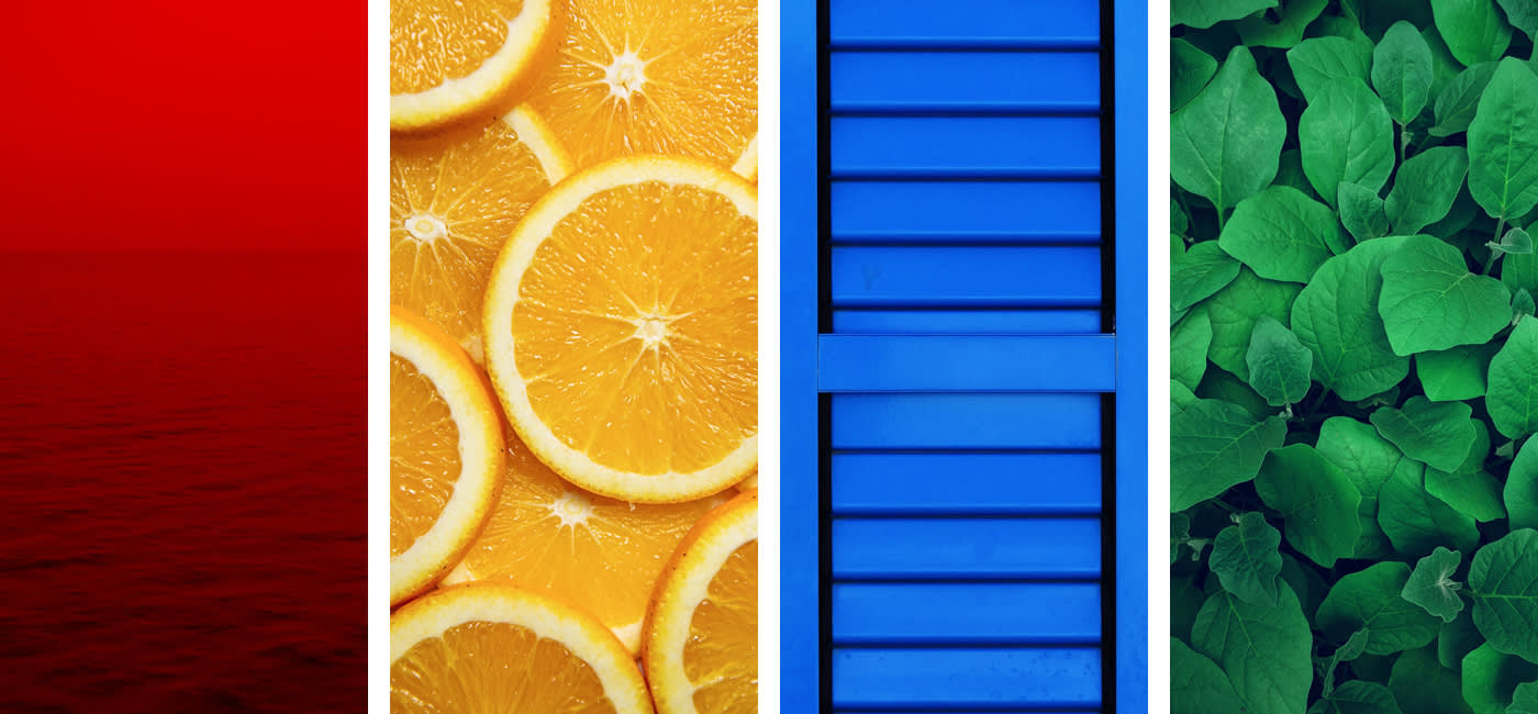
- Warm colors include shades of yellow, red, and orange
- Cool colors include shades of blue, green, and purple
- Neutral colors include gray, black, and white
How to build color schemes and palettes
Color palettes or schemes are concrete color combinations that work well together and create certain effects. Color schemes can be constructed by starting with your choice of a base color, then following some simple rules.
The following color schemes are often used in professional art and design:
1. Monochromatic: You use nothing but different shades and tones of your base color, only modifying it by adding black, white, or gray. Think old-school sepia photographs.

2. Analogous: These are colors that are next to each other on the color wheel. They provide a natural and appealing color harmony but can lack contrast.
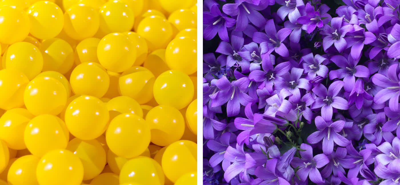
3. Complementary: Complementary colors are directly opposite each other in the color wheel. They create striking and dynamic designs because of their strong contrast.
4. Split-complementary: Split complementary color schemes are made up of the base color that you choose, and the colors that lie to the sides of the complementary color on the color wheel. The contrast between the base color and the split complementary colors are high, but not as high as the pure complementary contrast. This creates a somewhat soften but still dynamic design.
5. Triadic: In this color system, you choose the three colors equidistant from each other on the color wheel – like a triangle. The base color is often used as the dominant color in a design, while the other two colors are used to create accents. The benefit of using triads is that they create exciting designs because the contrast is so high.
6. Tetradic: A tetrad is a special variant of the dual color scheme. Four colors are chosen that are equidistant from each other on the color wheel, like the points of a compass. This is a rich and dynamic color scheme because there is no clear dominance of one color, instead using two pairs of complementary colors to create intense contrast. Tetrads can also be very aggressive, so they require careful planning and a sensitive approach.
How to use dominant and accent colors
Now that you’ve chosen a color palette, your next task is to assess which color should be dominant, which should be subordinate, and choosing any colors you will use as accents. It’s all about where and when the colors show up in your design.
- Dominant color: The dominant color does not necessarily have to take up the most space in your design, but it should be the color that your viewer notices first. It will usually be the color you chose as the base for your color scheme – it’s the color that someone would use to describe your design.
- Subordinate color: this color has a visually weaker effect than the dominant color and acts as either a contrast or a complement.
- Accent colors: Accents are used to highlight detail. You should choose colors that have a strong contrast to the rest of your color palette and use them sparingly.
A little bit of homework
Now that you have a grasp of some of the basics of color theory, why not do a little research and get a feeling for how the pros use color? What paintings and artworks are out there with warm color schemes? Which logos or designs use triadic color schemes? Or maybe the other way around – what color schemes are used in art or paintings that you love? You might discover similarities you hadn’t noticed before that can help you in your own designs.
If you want to play around with color wheels, practice building color schemes, or just want to look at images using certain color schemes, we recommend Adobe Color. This is a great tool that designers often use to find inspiration. You can select a base color, choose your rules, and Adobe Color will do the rest to create a color palette – it’s a fun way to get a bit of experience thinking intentionally about color.
Inspired to play with color and put your theory into practice? Why not experiment with the color wheel and create some exciting color-based designs!
The post Color Theory in Design: Putting it into Practice appeared first on The US Spreadshirt Blog.
Looking for cool gifts? Check Rott515 store!