Looking for cool gifts? Check Rott515 store!
Last updated on December 15th, 2022
Several techies strongly believe that this year will experience a major transformation of web design and development elements. We already have been experiencing its footprints from quite some time. So, what exactly has been the root cause of such major developments: WAP websites easily accessible for everyone or the launch of smartphones that have completely redefined the user experience? Well, so much has changed in terms of device developments and web designing that it is almost impossible to attribute just one factor for the same.
Let’s Dig A Little Deeper To Know If Responsive Design Overpower Pixel Perfect Design In 2023
Design Diversions From Fixed Width To Varying Form attributes
Fixed web layouts defined the whole web experience prior to launch of smartphones and other similar devices. However, the constraint to work with fixed layouts, where there was little room for experimenting things, made them quickly fade out. In fact, the web designers were restricted to working with fixed width of 760 to 960 pixels sizes. So, they were bound to waste much of their development time ensuring only the correct placement of all web items on a web page.
The advent of responsive web designs or the fluid designs have spurred major changes in web development arena. And the changes made designers learn the act of focusing on proper centering of web page content along with many other advanced pixel perfect design elements. Moreover, the launch of several micro devices such as palmtops and smart watches also greatly impacted the traditional ways of websites or apps viewing.
The smart TVs and digital media players are constantly redefining the web viewing experience on bigger screens as well.
Focus On Responsive Designs
The best tip for web designers to follow in 2023 is to shift their focus on responsive designs completely. That means their design should effectively cater to different screen spaces allowing for perfect element rearrangements with the ever-changing sizes of display screens.
After deciding design layout, the next big thing for designers to target is the design creation purely based on the percentage dimensions instead of the fixed pixel units. This will help the UI (User Interface) elements maintain its fluid layout, with perfect spatial weighting.
The whole process of effective placement and clarity of pixel perfect design elements that ensures perfect fitting of each web elements to suit wide range of potential resolutions is quite time consuming. However, the final outcome will definitely ensure that available screen space has been put to optimum use.
Elastic layout is yet another method to be considered that effectively makes use of the available screen space through use of ‘em’ measurements. Here, font height determines the layout structure.
Maintaining Content Hierarchy
Responsive layouts are not only concerned with resizing elements to ensure that websites fit well with the available screen size, but they also talk of content hierarchy as well.
That means how a desktop computer’s content can effectually be stacked for display on mobile phones; should be on designers mind while handling content hierarchy. A piece of advice: designers should avoid insertion of specific breakpoints in the beginning.
Rather, adding breakpoints after fluid build would be a much better option because it will not hamper with the website’s overall resolution that keeps on changing with the browser window size. Special focus should be on maintaining pixel perfect design coherency with the content flow so that perfect viewing and readability of the content can be ensured in different screen sizes.
These similar concepts can be used for native app designing on tablets and smartphones too, since Android and iOS, both the operating systems offer inbuilt functionality for handling various screen sizes.
With development of Apple’s High Dots per Inch (HiDPI) Retina display, designers should now consider issues of image quality too, shifting their focus from general design layouts.
Multitude Of Devices With Varying Sizes
With the launch of these high resolution screens, it will become mandatory for the designers to generate images in several sizes so as to make them perfect fit for any screen size. However, this can easily be achieved by using proposed ‘srcset’ attribute with the ‘img’ tag.
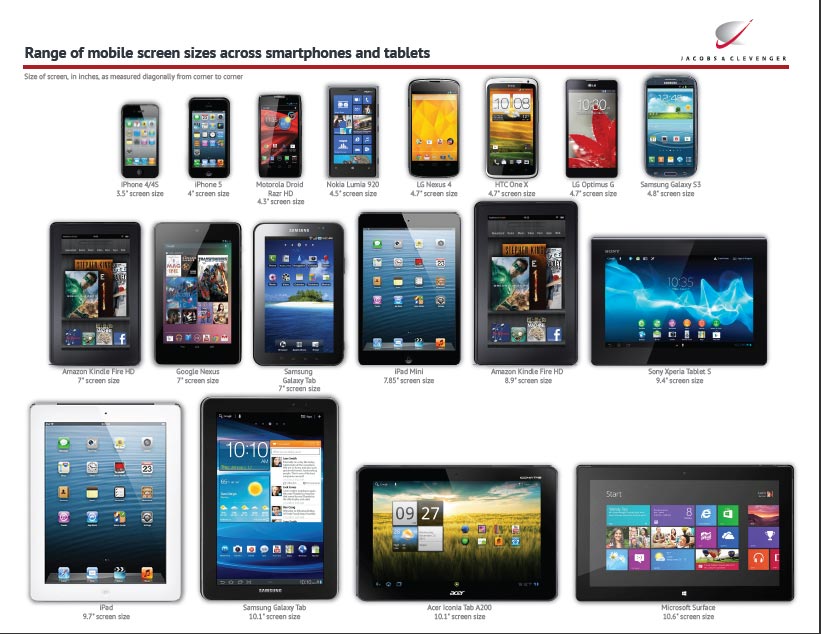
The designers should prepare themselves for future designs creations so that they are able to cater their web designs to broad array of digital devices with varying screen sizes. This will help them head towards a responsive and fluid website’s pixel perfect design that displays well on all devices with different screen resolutions! And who knows, this might make pixel perfect design extinct in 2023.