Artist update: Search improvements and experiments
Looking for cool gifts? Check Rott515 store!

40-something creatives: What should we do next?
Five steps to help determine what we should do for the rest of our lives

I get a fair amount of inquiries from my former colleagues and industry friends about what they should do next. They range in age but I’ve been particularly surprised by how many in their late 30s and early 40s reach out to me seeking perspective. And this has increased in the past twelve months noticeably more so than in the previous several years.
Several factors are at play here. A, It’s a function of myself getting older (although I’ve been in denial about this for the past two decades), and B, the creative and technology industries are changing so drastically. The pandemic has accelerated and generative AI is exasperating these changes so much more quickly than anyone anticipated that the future is murkier than ever before.
Many of us have good, established careers and positions in our respective fields and companies. Some of us have or have had “executive director,” “VP,” “managing director,” etc, in our titles. A few of us are or have been even chief ___ officers at very respected companies.
20s, 30s, 40s
We thought we deserved the VP or the Creative Director titles in our 20s. We thought we deserved higher pay. We thought that the grass would be greener on the other side. We thought that there would be work that was meant for us and we were meant for them.
We worked hard. We jumped ship. We got those titles, promotions, and money. We thought that we had more time to figure out what to do with work and life.
And then, as we approach our late 30s and early 40s, one inevitable question seems to creep up on us. It’s a much trickier question to answer than before: What should I do next?
It’s trickier because when we reach our 40s, there aren’t going to be that many “nexts” left in our careers. It’s also more difficult to keep jumping ship in our 40s every two years than in our 20s or even 30s.
This question also weighs heavier on us because “next” could imply “ for the rest of my life.” That’s a daunting thought.
When we were in our 20s, we still had more than 30, or even 40 years to go in our careers. It was ok to not know where we wanted to go in life or not have figured out life. It was ok to change course or to meander. There was a lot of time left “in the rest of my life.”
In our 30s, we encountered opportunities to lead, make more money, and move to new places. Some of us were promoted quickly, quicker than we (ok, I) should have been. We also started raising families and paying mortgages. We also became a little cynical about our industry. But it was ok. We were making good money. There were also starting to be more job options than there used to be. In addition to design firms and agencies, consultancies and in-house agencies started to hire us. And even more money came. With that, our expectations for our own lifestyles rose without us noticing.
As we get older, we collect various financial responsibilities in the forms of families, mortgages, cars, vacations, etc. Some of these aren’t responsibilities but rather, luxuries we bought into and lifestyles we got used to. Work is a job you can quit but family is work you can’t quit. We could technically quit our lifestyles but are we willing? Not so sure.
These financial responsibilities could hold us back. And if we have some wrinkles in life as I do, such as shared custody of kids due to a divorce (another topic to write about if I shed enough of my ego), our professional decision has much, much bigger consequences and implications.
Another realization that we denied for a long time: all of a sudden, the big Five-O is not that far away. As we watch our parents grow older, retire, and become more dependent on us, those futures for ourselves become more real. Yet, in our 40s, we aren’t quite old enough to cruise control our way into the career sunset.
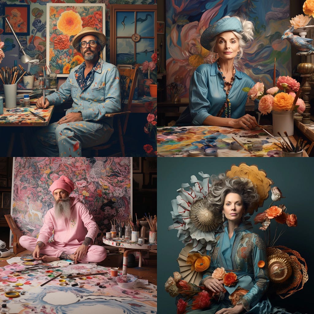
Side note: I asked Midjourney to generate an image but was disappointed by the lack of diversity and I didn’t see myself in it. I wasn’t going to use this but I thought I’d share here. AI is grossly biased and that is a problem.
Relevance
Being experienced is a good thing but there are only so many executive or managing director roles to go around. We had the digital chops that everyone craved but that was more than ten years ago. What used to be our differentiator is not only something everyone now has but can offer more cheaply and quickly. Have we become too expensive?
Is this why we are seeing more posts on LinkedIn about “being set free from (insert Big Tech here),” and/or “spending more time with the family,” a recent euphemism as Brian Morrisey of The Rebooting put it in our recent conversation?
In addition, there is economic and technological pressure that could make us redundant or worse, irrelevant.
Does it feel like the pace at which technologies, and therefore, the world around us, move has substantially picked up, compared to two decades ago when we started our careers? Or are we reaching the cognitive threshold of learning new technologies? Do we just not have enough time for ourselves like we used to? Yes.
So, as creatives in our 40s, with all these responsibilities as well as changes around us that can render our creative skills and experiences unnecessary just with a few prompts, what the hell are we supposed to do?
Not knowing is where you start
Most people who reach out to me are quite open about the fact that they don’t know what they want to or should do next. Some even admit that they might be having a professional existential or identity crisis. I was, too.
When I get these inquiries, I tell them first that I can’t tell them what’s right or wrong for them. I don’t think I can nor should I provide the answer to “What should I do next and for the rest of my life?” Instead, I’m happy to share the thought process I went through, where I was/am trying to go, and what to do in life, with a caveat that it may not apply to most people.
My role often is just to have a chat over coffee, ask some questions, and hope that those questions might help them find what’s inside them already.
The same goes for you with this post.
1. Future: Visualizing our paths ahead
As I was reaching my 40s, I started to visualize various possible paths ahead, and here’s what went through my mind about each:
- Continue where I was: “I am the chief creative officer of a renowned digital agency and I like my job. I’m proud of what I’ve been able to achieve here. I could continue helping build this company.”
- Move to another creative agency: “I’m getting calls from headhunters about a similar job at other agencies. They need some fresh blood to come in and turn things around. I’ve been able to learn about leadership, business, management, and finances here for the last 10 years. I could deploy my skills and experience to help someone else.”
- Big Tech: “I’m also getting calls from Googles, Apples, Facebooks of the world. Many of my friends are jumping ship to tech. Money seems also nice. I may be able to retire if I stay for a decade.”
- Start my own thing: “I’ve always been curious about what it’s like to start my own company and run it. Also, things are changing around me. I need to evolve and change.”
I do realize that I was fortunate to have these paths as my options.
Paths 1, 2, or 3 felt more secure. They also meant more money and stability at least for the foreseeable future. However, they felt predictable, for better or worse. I could see the next twenty+ years of my career in front of me at whatever company that I would work for. That kind of scared me.
Path 4 was by far the most unpredictable and the least secure. To go from having a paycheck one day to nothing when we have a family to feed in one of the most expensive cities in the world would put a LOT of strain on ourselves if we are the main breadwinner. With this unpredictable path, though, I couldn’t really see what lay ahead. To me, that meant I could potentially carve my own path. That felt exciting.
Then I asked myself the following questions. Not necessarily in this order at the time when I was trying to figure things out but this would be the order in which I recommend you interrogate these questions.
2. Self: “What’s really important to ME?”
As I wondered about the next 10, 20, or more years of my career, I started to make a mental list of things that were important to me.
- I want to have a positive impact on the world.
- I want to be in more control of my own destiny.
- I want to be able to provide a decent life for my family.
- Money is nice but it doesn’t buy me happiness.
- I like making things. The Work.
- I’ve always challenged myself, which led me to places I didn’t know I could go.
- When I’m 80 years old, I want to be able to say “I did it.”
I’m making it sound simple here but mind you, this internal debate took place over the course of a couple of years. The decision did become clearer for me after going through this exercise.
By the way, I will say that starting your own company is liberating but it isn’t for everyone. This post is not about that, and perhaps another topic to write about.
After several years of mental meandering, this is the question that I kept asking myself about the rest of my professional life:
“What’s really important to me?”
This is usually the one and the first question that I pose to my former colleagues and industry friends when we chat about their possible futures. We need to ask and keep asking this question ourselves over and over.
3. Place: Where do I want to live?
This was a constant topic of conversation between my wife and I for quite some time. Eventually, we decided New York City (or the vicinity) was the place where we wanted to spend the foreseeable future for both of our respective careers and lines of work we do (my wife is a life career coach), and for our kids and their education/life experience.
Having recruited many people in the US, Europe, and Asia, many people would say geography didn’t matter to them and would follow good work. That’s not true. It always matters greatly even if you don’t have kids. We need to really scrutinize this question and make a decision on this before we make a career decision. If we aren’t happy with where we live, we aren’t going to be happy with where we work.
If we have kids, what kind of education we want to provide for them, particularly for middle and high schools, is a huge factor and you need to settle this topic with our spouse.
This question helps prioritize our life and family decisions and that helps in narrowing our options.
4. Work: What kind of work do I really want to do?
As creatives, we like making stuff: The Work.
The best creatives I respect-and I mean creatives in a wider sense including designers, architects, artists, musicians, writers, builders, developers, etc-are the ones who keep making The Work. I find them inspiring. I also like helping other people do better work. I take joy in seeing others be able to make The Work that they might not have done on their own.
However, it’s possible that we might not see our futures as an extension of the previous two decades of our careers.
I will say that being in our 40s isn’t too late for a career change. That is, as long as we are willing to take roughly two years of a transition period to learn about ourselves and gain new skills. During this period, we need to discuss with our partners, particularly about money, and work together to make ends meet (see below).
Once we go through this transition, the rest of our lives—as individual professionals and as life partners—will be much more liberating and possibly more fulfilling.
5. Money: How much do you really need?
Money is a tricky thing. One of my family members told me in my 30s that I didn’t seem happy as I was making more money. I realized that more money didn’t necessarily give me real happiness.
Also, whenever I made decisions based on or heavily influenced by money, I always regretted my decisions. This was true for both my personal decisions as well as management decisions.
Like Place, it’s something we need to have an honest conversation about and to see eye to eye with our life partner. It can get uncomfortable at times. If not, we will end up paying the price. I did.
Having more money could benefit us in various ways. But be aware that it could also be crippling, especially in our 40s.
To summarize, here are the five steps I went through:
- Future: Visualize my possible paths ahead
- Self: Ask what’s really important to me
- Place: Decide with my partner where to live
- Work: Search for joy in The Work or commit to a career transition
- Money: Make money work for me, not the other way around
Thanks for reading. Please consider subscribing to my newsletter on Medium or Substack.
Originally published at https://reiinamoto.substack.com.
40-something creatives: What should we do next? was originally published in UX Collective on Medium, where people are continuing the conversation by highlighting and responding to this story.
Looking for cool gifts? Check Rott515 store!
Artist update: New tagging limits to reduce tag spam and improve relevance and conversion
Looking for cool gifts? Check Rott515 store!

The single most important skill for a Chief Creative Officer
Creating an impact as a leader isn’t always about doing big things

Before starting my own company I&CO, I was the Global Chief Creative Officer (Global CCO) of AKQA, an international digital creative agency. I joined the agency back in 2005 (yes, 2005) and spent just a little over a decade there. Prior, I cut my teeth in creative leadership at R/GA, another prominent digital agency, as an Executive Creative Director.
In both situations, I was way too young.
Naturally, I made a lot of mistakes. Some of them were so bad that just thinking about them now makes me want to crawl under a table and hide, even after more than a decade.
“What is the single most important skill for a Chief Creative Officer?”
Carren O’Keefe, a newly appointed CCO at Digitas UK and an old colleague/friend of mine, recently asked me. This is a simple question but not so simple to answer. There are so many skills, qualities, and experiences one should have in order to be a good CCO. Numerous articles, books, videos, classes, and podcasts have been produced on leadership, and quite a few on creative leadership. There’s even an ultimate guide on how to be a Chief Creative Officer on Amazon.
The thing is, all of them are right. For some. None of them are right for everyone. Ultimately, each person needs to figure out what works for them.
This post is just my view and probably won’t be right or even relevant to most. If it is remotely helpful for just one person, that’s all I could hope for.
When Carren asked me the single most important thing for a Chief Creative Officer, many thoughts raced through my mind. Being able to inspire (obvious), being the best creative in the room (arrogant), being a good presenter (too narrow), being a good mentor (a must), seeing what’s coming (no one knows), etc.
Where I landed was this: Humility.
When I was a couple of years into my tenure at AKQA, I was based in San Francisco. There were about 60 people in the creative department that I was leading at the time there. One day, I was getting coffee in the kitchen and saw a young-ish person I hadn’t met before. “Hi, I’m Rei. Are you new?” I asked.
“Oh, hey, I’m ____,” he replied. I then asked him what he did at the company. After he told me he was a copywriter and had just started a few weeks ago, he asked me the following.
“What do you do here?”
This benign question surprised me. Even offended me a little, if I were honest. My first inner thought was “I am your boss’s boss. Possibly their boss as well. I’m the head of the department you belong to. You should know me.” For a split second, I almost said those words out loud.
How young, insecure, and arrogant I was back then.
Quickly, I thought that would be a douchey move because it would make him feel embarrassed. I managed to stop myself. Instead, I told him that I was one of the designers (which was true as I was/am a designer and did a fair amount of hands-on design work). Instead of blaming the newcomer for not knowing his department head, I realized that I hadn’t done enough to make myself visible to him as the department head, and I should have had enough grasp of my own team to know new joiners.
The following week at the department meeting, I told the team that I would stop by their desks every two weeks to say hello to people, one on one, to get to know each person a little. Every two weeks because I was traveling a fair amount at the time and I knew I wouldn’t be able to commit to doing my rounds every week. By announcing it to the department, it was a type of pledge. This gave me a simple routine that I could follow. Or at least try.
For the following 12 months, while I must admit that I did fall short and wasn’t able to see everyone every two weeks, I stuck to this routine, say 75% of the time. Sometimes, people weren’t at their desks, I was traveling and out of the office too much, or just didn’t make enough time to do this routine.
While I’m sure some people didn’t enjoy their boss or (their boss’s boss) checking on them often, to my delight, some people appreciated it more than I thought.
On one visit to someone’s desk—I’ll call him Matt—I noticed he had a digital stickie note on his screen that kept track of which day I came around to his desk. When I pointed that out, Matt said “Oh, yeah” with a slightly devilish grin. He took joy in keeping tabs on his boss.
After one year of doing this, I got to know everyone a little. It gave me a decent grasp of what each person was working on at any given moment. I also believe, perhaps selfishly, that the department got stronger as a team.
There were many lessons I took away from this very simple routine. Most of all, it reminded me of the importance of humility and admitting your fault.
The best way to change the world around you is to start changing the way you behave.
This was a recorded conversation for my podcast “The Creative Mindset.” If you are curious about this and other conversations, please check them out and follow the show wherever you get your podcast:
The single most important skill for a Chief Creative Officer was originally published in UX Collective on Medium, where people are continuing the conversation by highlighting and responding to this story.
Looking for cool gifts? Check Rott515 store!

Puma Logo: History And Evolution Of The Iconic Design
Looking for cool gifts? Check Rott515 store!
The Puma logo is among the most iconic symbols in the world of sports apparel and footwear. From a simple design to its current outstanding design, the logo has lured audiences and helped the brand establish a solid footprint in the global market. However, it took decades to evolve into the impressive and unique design it is today. Let’s delve into the intriguing journey of its evolution.
As a company grows, it ventures into a broader market targeting different customers. So, a global brand’s logo should reflect its ambitions to target more significant markets. Most businesses, scaling up worldwide, often tweak or redesign their logos.
The Puma logo is an emblem of Puma SE, a German multinational corporation. The global giant designs and manufactures athletic and casual footwear. It also is known for making sports-related apparel and accessories.
With the growth of the company’s business, its logo also had to go through an evolutionary phase to look today as a refined brand symbol. Its logo design is now consistent and has appeared almost the same for years on its sports shoes, shirts, and other apparel. The emblem is inseparable from the company’s branding and marketing campaigns.
A Brief Puma Logo History
Puma is a global brand, and it would be interesting to know how the brand and its emblem grew and evolved over the decade. So, here is the brief Puma logo history.
The Puma label was registered in October 1948 as the company’s trademark. According to the company’s official page, “PUMA has relentlessly pushed sport and culture forward by creating fast products for the world’s fastest athletes. For more than 70 years, we draw strength and credibility from our heritage in sports.”
The company’s founder Rudolf Dassler had first named it ‘RUDA’, the mix of his name’s first two letters. The company dismissed that idea later and adopted the brand name PUMA.
This is because, as per the company’s Facebook page: “Rudolf’s vision was that all of his products would embody the characteristics of a Puma cat: speed, strength, suppleness, endurance, and agility — the same attributes that a successful athlete needs as well.”
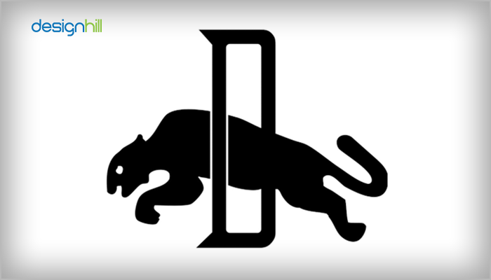
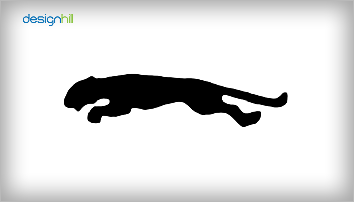
1948: The ‘D’ Logo
The show manufacturing company launched its logo first in 1948. It was a design of a leaping Puma cat. Its chief feature was the puma jumping across the large but thinly spaced letter D. The letter stood for the company’s founder Rudolf Dassler.
1959: The Form Strip Logo
But it was in 1968 that the company came up with a logo that conveyed Rudolf’s vision to some extent. It combined a wordmark and picture. This was also when the famous white form strip appeared on shoes and became part of the logo.

1968: The Leaping Puma
In 1968, the company brought its Puma icon back in black, making it a central visual identity of the brand. It was a cleaner design with a sleek, sophisticated leaping puma cat.
During the ‘70s, a bold and enlarged wordmark accompanied the leaping cat. The brand name was in a custom sans serif typeface.
![]()
1974: Wordmark And The Cat
In 1974, a slightly different version of the insignia appeared. The leaping Puma cat was on one side of the wordmark this time.
1980 – 1982: The Cat Alone Logo
In 1980, the company removed the wordmark from the remarkable logo. The Puma cat alone represented the brand. Also, it is noticeable that the company uses the cat-alone logo alternatively even today.

1982 – 1988: The Wordmark Is Back With The Cat
The sports shoes and apparel manufacturing giant brought back the wordmark with a slight twist in the 1982 logo. The wordmark had the shade of the famous form strip in white. So, the logo redesign was again a combination of the brand name and the leaping cat. The company kept this mark for eight long years.

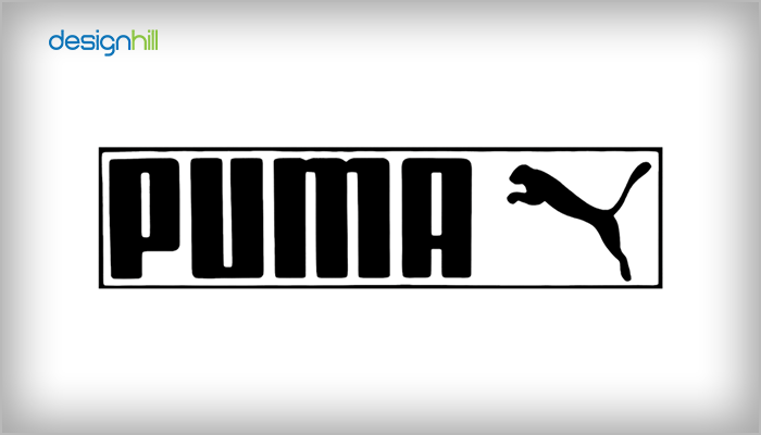
1988 To Today: Aesthetically Designed Logo
In 1988, the company removed the white form strip from the wordmark. So, it was the same emblem with the brand name and the leaping cat but minus the form strip in 1988. It continues to be the company’s core brand identity.
After this brief Puma logo history, you would like to learn some lesser-known but interesting facts about the Puma logo.

5 Things To Know About The Puma Logo
Most iconic global brands are known for their uniquely designed, impressive logo. People recognize and align them with a brand. The Puma logo is an emblem that people know for high-quality shoes, such as Puma cricket shoes and sports apparel. But the emblem has its evolutionary history.
Looking For a Logo Design?
We have helped thousands of business owners from all around the world with their graphic design needs such as a logo design, website design, social media posts, banner design and much more.
Get Your Logo DesignGet a Free Quote
Here are five facts that you will find interesting about the Puma logo:
01. The First Puma Logo Had ‘D’ In The Upper Case
The first Puma logo was launched in 1948 and looked much different from the present-day logo. At that time, the logo featured the letter ‘D’, with the puma cat jumping through the letter. The D letter represented the company’s founder Rudolf Dassler. In later years, the symbol had the word Puma added to it.
This monochrome image was not a great design but it successfully drove people’s attention. The Puma symbol with the cat jumping through the letter D also appeared in a different version within a hexagonal box.
![]()
02.The Logo Conveys Agility And Prowess
The leaping puma cat conveys prowess and agility. Therefore, the puma becomes a natural symbol of prowess in sports. In this way, the silhouette becomes the brand’s visual identity, and the cat symbolizes agility, grace, and strength.
So, the logo aligns with Puma’s mission statement: “to be the Fastest Sports Brand in the world.” The leaping Puma cat conveys that the brand intends to be ahead of its competitors in the sports goods and apparel manufacturing industry.
03. Once, People Mistook The Form Strip For The Logo
Besides the leaping Puma logo, the form strip was also a famous element of the company’s brand. It was so popular and familiar that people once considered it the company’s real logo.
But the form strip was there for a purpose. In the 1950s, manufacturers started using lightweight materials to make sports shoes. But the players could not gain much control of their feet movements due to the light material of the shoes. They had to run, kick, and perform various actions on the field.
So, during the 1958 World Cup, Puma launched boots with the form strip. It was a leather strip on the shoe’s side to support the players’ feet to help them move quickly.
At that time, the company gave a description of the form strip on the shoe. Its description said, “A form strip shoe cradles the foot securely while not compromising the range of motion and without adding too much pressure. It also prevents twisting the ankle or stretching the leather too much to the side or towards the heel.”
![]()
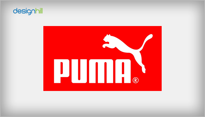
04.The Puma Logo Is Officially In Black
The official color of the Puma logo is still black, though the symbol appears in red and white colors. But the company has experimented with multiple colors in the past to keep the audience engaged and also to convey a brand message. Still, the company continued to keep the color black officially.
A reason behind keeping the black color is that on any other background, black background is an excellent transparent overlay. The company also developed inverted logo versions with a white base on multiple silhouettes.
An intention behind keeping the black color was to make the logo memorable as it would look sleek and simple. Black also is the color of power, strength, and authority.
05. The Logo Is Known As The ‘No. 1 Logo’
Another fact you should know about the Puma logo is that in 1968, the company introduced it as the ”No. 1 Logo.” The logo featured the cat jumping the wordmark.
Since then, the company has kept the design the same. Instead, only minor changes, such as removing the eye and nuzzle, and ears are more prominent now.
Design Elements Of The Puma Logo
People can instantly recognize the Puma logo for its unique but simple design. It has just one typeface, a picture, and color, making it a memorable symbol of excellence in sports goods markets. Here is how we can describe the emblem’s design elements.
Font
The wordmark used in the Puma logo is the company’s name in big capital letters. So, the sports shoes and apparel maker company conveys its brand personality with such a wordmark. Also, the new Puma logo typeface is sans-serif, and the letters have slightly rounded edges to make the brand look friendlier.
Pinpointing a particular typeface is difficult in the case of the Puma logo, as the company has yet to reveal it. But experts think the logo probably uses Quandor Regular or FF Softsoul Std Bold. The typeface used currently is slightly altered from what it looked initially.
Color
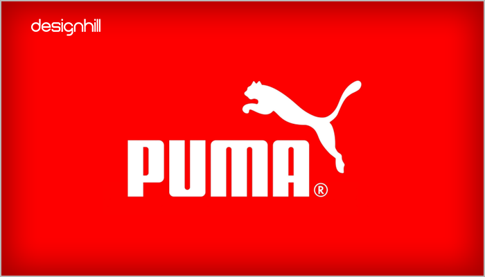
The Puma logo typically appears in black since it is the brand’s official color. Black evokes authority, power, and strength. So, the company chose black to convey the agility and power required in a sports field to compete hard.
Still, sometimes, the company uses a different color depending on the context. That is why the logo on some of its products is in white lines with solid red background. It also appears in a white and dark navy color palette.
These are the key things you might find interesting in the iconic Puma logo. The design is the result of its long evolutionary history. Also, the logo grew to reflect the company’s business and global ambitions.
Are you also seeking a unique logo for your newly launched business? Designhill, the leading creative marketplace, can help if you face budgetary constraints. You can explore its logo maker to create a logo without any design experience. Depending on your brief of colors and font choice, the AI-based logo maker will generate multiple logo ideas. You can customize an idea to make it your core visual identity.
Wrapping Up
The Puma logo is an iconic global symbol of excellence in the shorts, shoes, and apparel markets. It conveys sports people’s ambition of being faster and more competitive. But the logo design went through its many evolutionary phases, with the company tweaking and redesigning it before getting the current logo.

Amazon Logo Decoding The Hidden Meaning, Evolution And History
Looking for cool gifts? Check Rott515 store!
Last updated on July 4th, 2023
Amazon is a leading multinational technology company and one of the world’s largest e-commerce platforms. Like many other big companies, it’s recognized for its unique and impressive logo that effectively conveys the brand message to the target audience. The logo is a remarkable design and has helped make the company a household name. But its logo has a long evolutionary history.
Amazon was founded on July 5, 1994, in Seattle, by Jeff Bezos, and it was an online marketplace for books back then. Now, the marketplace has hugely expanded, covering almost all product categories.
The company owns multiple subsidiaries, such as Amazon Web Services (cloud computing), Kuiper Systems (satellite Internet), Zoox (autonomous vehicles), and Amazon Lab126 (computer hardware R&D). The company is today the largest online retailer and marketplace in the world.
Before we further explore the history and evolution of the Amazon logo, first, know what the logo means.
Hidden Meaning Behind The Amazon Logo – History & Evolution:
Amazon logo may look like a simple design at first sight. But it has its message for its target customers. What could be the hidden meaning of the logo? Here is how we can decode it:
Hidden Meaning
A vital feature of the Amazon logo is its arrow. It is yellow and gets noticed from a long distance. But it has a meaning that defines the brand for its consumers.
We all know what a smile means. It conveys that the person is happy and satisfied in life. A smiling person spreads happiness all around, as a smile is contagious. That is why Amazon chose the arrow as an element of joy in the logo.
The logo has an arrow that looks like a smile on the face. This conveys the happiness and satisfaction of a customer after buying from Amazon.
Also, the arrow connects the letters a to the letter ‘z’ of the brand name, conveying the products’ availability for the consumers.
History And Evolution Of The Amazon Logo
Amazon logo is a famous emblem that people recognize as a trustworthy symbol of shopping online. But the logo design was different from what it is today. The logo started its journey on a humble note in 1995 and gradually got Amazon new logo for its target audience. But it always has been a simple design that people connected with easily.
Here is how the Amazon logo evolved:
1995 – Literal Version Of The Company Name
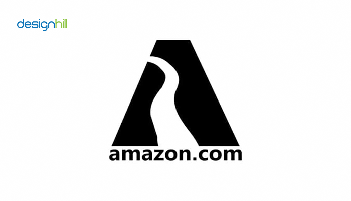
Brand Amazon got its name from the world’s longest river Amazon. Its first logo in 1995 had the river as the main feature. The letter A of the brand name formed a trapezoid. A long and wide white curve in the middle of the letter represents the river.
Turner Duckworth designed this old Amazon logo with a stylized ‘A,’ which was the chief element of the design. The letter in black also symbolized the South American river’s contours.
The company and website name “amazon.com’’ was also incorporated at the logo’s base along with the caption “Earth’s biggest bookstore’’.
The wordmark was in a simple sans-serif typeface. So, the logo clearly showed that the store had the ambition to be the world leader in its sector.
This logo became Amazon’s brand identity at the beginning of the digital age. The designers had limited access to logo-designing tools back then. Experts and critics did not like the logo much. Many saw the river within the logo as old-fashioned and cliché. That is why the logo lasted only for two years until 1997.
1997- Detailed And Refined Version

1997: The e-commerce giant redesigned its logo with some changes in response to the criticism it received. This time, it had some details that represented the company’s growth.
The logo was still black and white but had a zebra pattern inside the letter A. The patterns looked like tree branches, representing the company’s expansion. But the company retained the wordmark ‘amazon.com’ at the bottom of the logo’s base. The wordmark also was there in anticipation of the dot-com hype in those days.
Looking For a Logo Design?
We have helped thousands of business owners from all around the world with their graphic design needs such as a logo design, website design, social media posts, banner design and much more.
Get Your Logo DesignGet a Free Quote
However, the logo design needed to be more attractive and have a great aesthetic.
1998 – Just The Wordmark Logo
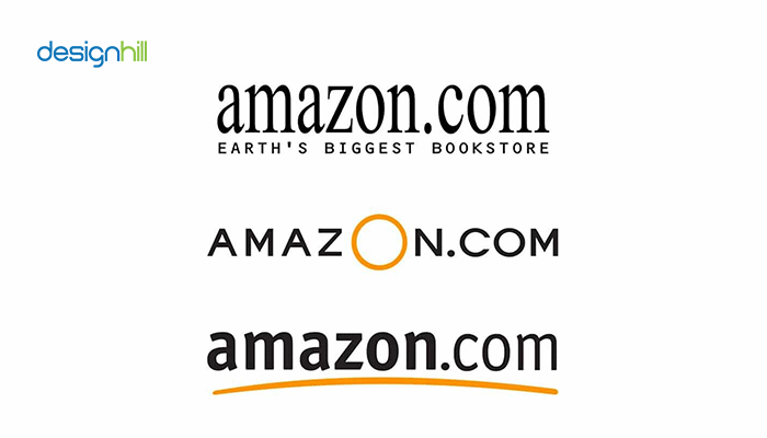
By 1998, the company had realized that the letter ‘A’ with the river inside the logo was not good enough to express its brand message fully to the new target customers. The world was switching fast to dot.com digitally, with everyone talking about it. Considering that, the company went for a complete overhauling of the logo.
So, initially, it settled for an ‘amazon.com’ wordmark logo and created its three versions. The Amazon logo change had the brand name in a simple serif typeface. The tagline ‘Earth’s Biggest Bookstore’ was incorporated underneath the brand name.
But this logo also could not stay for long, and a newer version replaced it. This time, ‘amazon.com’ appeared in upper-case letters to convey the brand’s dominance. Its key attraction was the big yellow letter ‘O’ of the name. The company got rid of the tagline. This design continued to represent the company for several months.
Then, by the end of the year, there was a new wordmark with a yellow swish underneath. The swish was slightly arched and later became the basis for today’s smiley company design. Also, the company name appeared in the Officina Sans typeface. The company name ‘Amazon’ appeared in bolder font to produce the contrast for easier visibility, while the ‘.com’ part was lighter.
![]()
2000 – Today: Wordmark With A Smiley Swoosh

The company developed a new Wordmark logo design in 2000 that continues to be the brand’s identity. So, the wordmark got slightly modified with the previous yellow bridge-like curve turned into an arrow that looked like a smile.
This time, the designers used the yellow swoosh to connect the letter ‘a to ‘z’, conveying the brand message that the company can buy everything from the store. It signaled the wide variety of products available for the consumers.
But the smiley arrow also represents the company’s satisfied customers as they smile after receiving the products at their doorsteps.
2021 – Amazon Phone App Logo – Redesigned Under Public Pressure

Amazon has used a logo as its shopping cart symbol for five years. It featured a brown box that stood for plain packaging. At the top, there was a blue adhesive strip with toothed edges. But soon, people protested against this logo as the strip reminded them of the toothbrush style of Adolf Hitler, the dictator.
Therefore, the company redesigned the Amazon Hitler logo by removing the uneven edges of the blue strip. Now the blue tape appeared plain without the edges. It was designed like someone neatly folded it, indicating the product’s unboxing inside.
After Amazon made the changes in its Amazon app logo, Amazon’s brand spokesperson explained the move by saying, “Amazon is always exploring new ways to delight our customers. We designed the new icon to spark anticipation, excitement, and joy when customers start their shopping journey on their phone, just as they do when they see our boxes on their doorstep.”
2022 – The Prime Logo Launched

The company launched Amazon Prime in April 2022 for those customers who could get free shipping and faster delivery on paying a monthly fee. The Amazon Prime Logo includes the old Amazon logo with the smiley yellow arrow. But it also had ‘Prime’ added by the side in blue to convey excellence, quickness, and friendly investment in the brand’s excellent service.
Design Elements Of The Amazon Logo
Amazon’s logo is an excellent example of how it conveys its brand message through strategic design elements. The logo features some creative elements that make it look unique and appealing.
The Arrow
The Amazon logo has a prominent arrow, which has become the brand’s visual identity. It has an arrow stretching from the letter ‘a’ and connecting the letter ‘z.’ Thus, it conveys that the e-commerce company has everything in the store for consumers.
Also, the arrow is in a smiley shape, indicating a happy and satisfied customer. The arrow design resembles a face. It is in yellow, which is the color of hope and sunshine.
Font
Amazon uses the Amazon Ember font for its brand name in the logo. It is a sans-serif font that designers incorporate to convey the friendliness of a brand. This was a specially-made font for Amazon.
Color
Amazon logo has black and yellow in its primary logo. The brand name Amazon is in black to convey its authority in its niche field amongst consumers.
The arrow is yellow, which gives the logo a distinctive look. Since the arrow is in the shape of a smile, its yellow color expresses the satisfaction and happiness on a consumer’s face.
So, we can say that the Amazon logo had to go through its evolutionary phase to reach the present-day design that it is for consumers. The logo can drive customers’ attention and convey a brand message.
If you, too, are looking for an impressive logo design for your business or thinking of redesigning it, Designhill is the right platform to help. You can launch your logo design contest to get your logo created by professionals from across the globe per your brief. Or, you can explore its logo maker to design a logo all by yourself quickly without prior design experience. Comes in three different packages, the tool lets you choose the one that best suits your needs. While the Basic package offers basic logo design files, you can get high-quality files, such as vector files (SVG, EPS & PDF) and raster files (PNG & JPEG), with its premium packages for a more professional logo.
Wrapping Up
Amazon is a leading eCommerce and technology company with a global presence. Its impressive and unique logo, a wordmark with a smiley arrow, is today’s famous online shopping symbol. The logo was first a simple letter A with a river design within. It, later on, was transformed into the wordmark only in black and yellow.
Bestsellers from July to December 2022
What did our customers stuff in their carts in the second half of last year? Discover the product highlights, color trends, and favorite combinations of Q3 and Q4 2022 so you can make the most of the back half of this year.
Top 3 Bestsellers
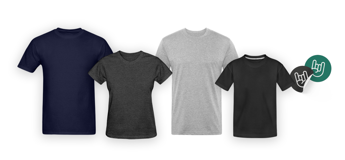
| Men | Women | Unisex | Kids & Babies | Accessories |
| Men’s T-Shirt
(ID 210) |
Women’s T-Shirt
(ID 347) |
Fitted Cotton/Poly T-Shirt by Next Level
(ID 1130) |
Kids’ T-Shirt
(ID 48) |
Sticker
(ID 1459) |
| Men’s Premium T-Shirt
(ID 812) |
Women’s Premium T-Shirt
(ID 813) |
Unisex Jersey T-Shirt by Bella + Canvas
(ID 175) |
Kids’ Premium T-Shirt
(ID 815) |
Full Color Mug
(ID 949) |
| Men’s Hoodie
(ID 111) |
Women’s Hoodie
(ID 405) |
Unisex Crewneck Sweatshirt
(ID 512) |
Organic Short Sleeve Baby Bodysuit (ID 401) |
Adjustable Apron
(ID 1186) |
The most popular colours
These colors are always a safe bet. Start with these to give you a firm – and high-selling – base, and fire off the fireworks of your ideas from there.
- black
- white
- heather gray
- navy
- charcoal
- red
- royal blue
Best-loved products and colour combinations
You’ve seen the hottest products and the coolest colors, but how do they go together? Are there surprises, or do the classics still reign?
- Men’s T-Shirt (ID 210): black, white, navy, heather black, heather gray, charcoal, royal blue
- Men’s Premium T-Shirt (ID 812): black, white, heather gray, charcoal gray, deep navy, red, heather blue
- Women’s T-Shirt (ID 347): black, white, heather gray, purple heather, heather black, pink
- Women’s Premium T-Shirt (ID 813): black, white, heather gray, charcoal gray, heather blue, pink
- Fitted Cotton/Poly T-Shirt by Next Level (ID 1130): black, heather black, heather military green, heather navy, heather royal, white
- Kids’ T-Shirt (ID 48) : white, black, turquoise, royal blue, heather gray,red
- Kids’ Premium T-Shirt (ID 815): black, royal blue, heather gray, red, charcoal gray, kelly green
- Adjustable Apron (ID 1186): black, navy, charcoal, red, white, royal blue
Now you know what your customers loved last year! Grab your pen, pad, or tablet and surprise them with fresh designs for their favorite products. If you’re hungry for more inspiration, check out our articles on the Top Search Terms from July to September 2022 and the Current Design-Occasions.
Got more questions about last years bestsellers? Let us know in the comments or ask in the forum.
The post Bestsellers from July to December 2022 appeared first on The US Spreadshirt Blog.
Looking for cool gifts? Check Rott515 store!
Top Search Terms July to September 2022
Our top 10 most searched terms for the for Australia, the US, and Canada give you an insight into the minds of your customers and the trends they were hungry for last year. Use this knowledge to shape your designs and make sure you are hitting the spot for your target market this year. How? Simply tag designs you have already uploaded with the matching search terms (as long as they are relevant!) or create new designs following the seasonal trends of last year.
United States
Top 10 Spreadshirt Searches
- Funny
- Summer
- Vintage
- Halloween
- Easter
- Birthday
- Geek
- Teenager
- Funny gym
- Breast cancer awareness
Top 10 Google Searches
- Royalty family
- Pastina
- Typical gamer
- Pasta
- Rainbow
- Chess board
- Sister
- Music symbols
- Cartoon pig
- Motocross
Canada
Top 10 Spreadshirt Searches
- Canada
- Funny
- Vintage
- Geek
- Quebec
- Toronto
- Canadian
- Halloween
- Ukraine
- Anime
Top 10 Google Searches
- Cow
- Axolotl
- Electrician
- Canada
- Pasta
- Braille alphabet
- Outdoor
- Tuxedo
- Planete terre
- Teacher
Australia
Top 10 Spreadshirt Searches
- Australia
- Christmas
- Ugly Christmas
- Breast cancer awareness
- Vintage
- Funny gym
- Geek
- 100 days of school
- 80s
- Father’s day
Top 10 Google Searches
- Greek letters
- Motorcycles
- Australian flag
- Cross
- Fiji flag
- Numberblocks
- Vintage
- Stay wild
- Breast cancer
- Retirement
Want more inspiration? Our articles on Design Events in July, August, and September and Bestsellers July to December 2022 should do the trick.
Still have questions? As always, we’ll do our best to answer in the comments below or on the forum.
The post Top Search Terms July to September 2022 appeared first on The US Spreadshirt Blog.
Looking for cool gifts? Check Rott515 store!

Most Important Occassions: July – September 2023
The third quarter of 2023 is fast approaching – what design events does it have in store for your business? This selection of important dates are just waiting for your design ideas.
- Canada Day, July 1st
- Independence Day, July 4th
- World Conservation Day
 , July 28th
 - International Friendship Day, July 30th
- International Beer Day
 , August 4th
 - International Cat Day, August 8th
- Father’s Day, September 3rd (AUS)
- National Grandparents Day, September 10th(US)
- Oktoberfest
 , September 16th to October 3rd
More exciting events await you in our calendar. Click through the next three months and discover all the occasions for your designs.
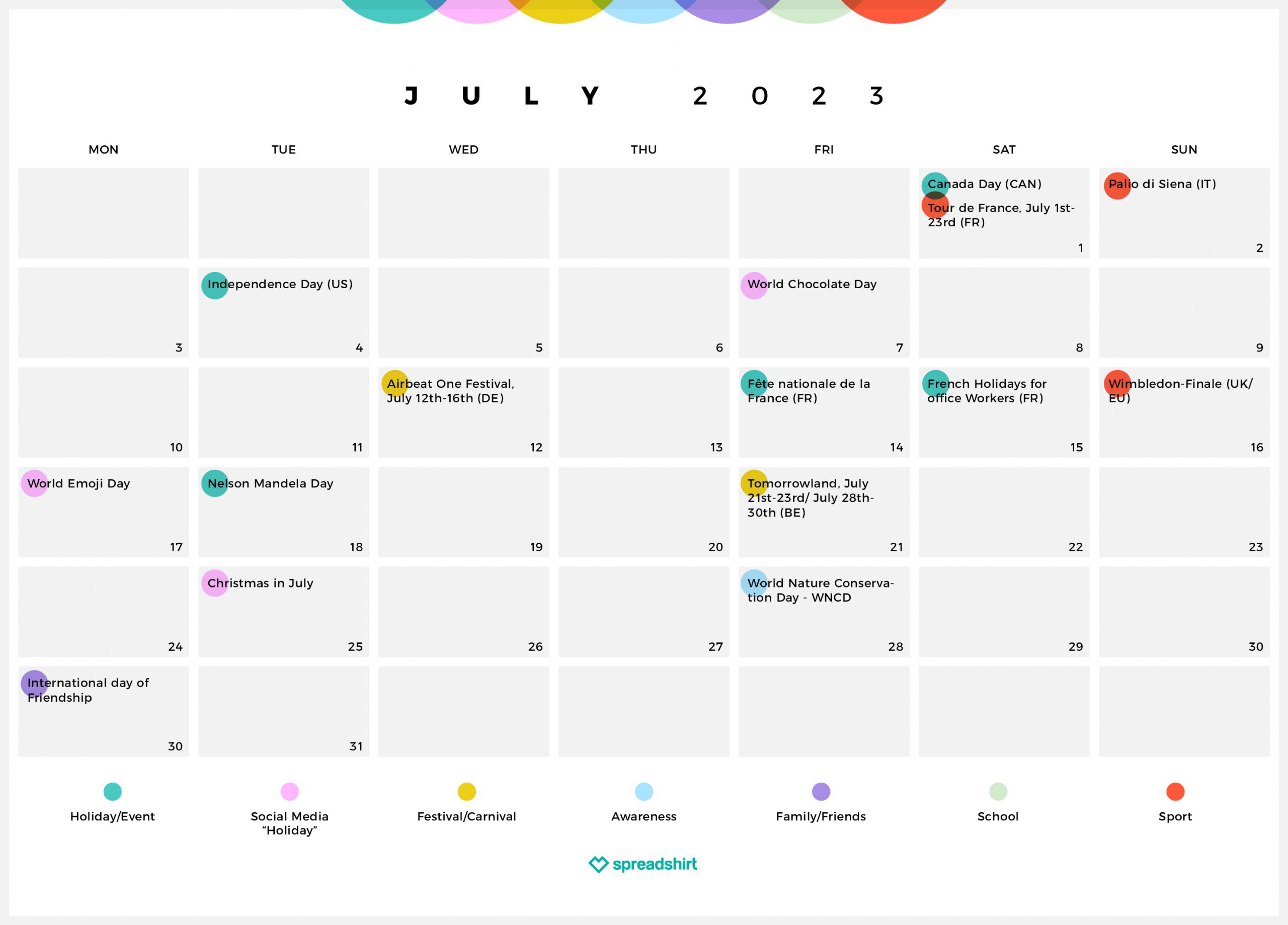
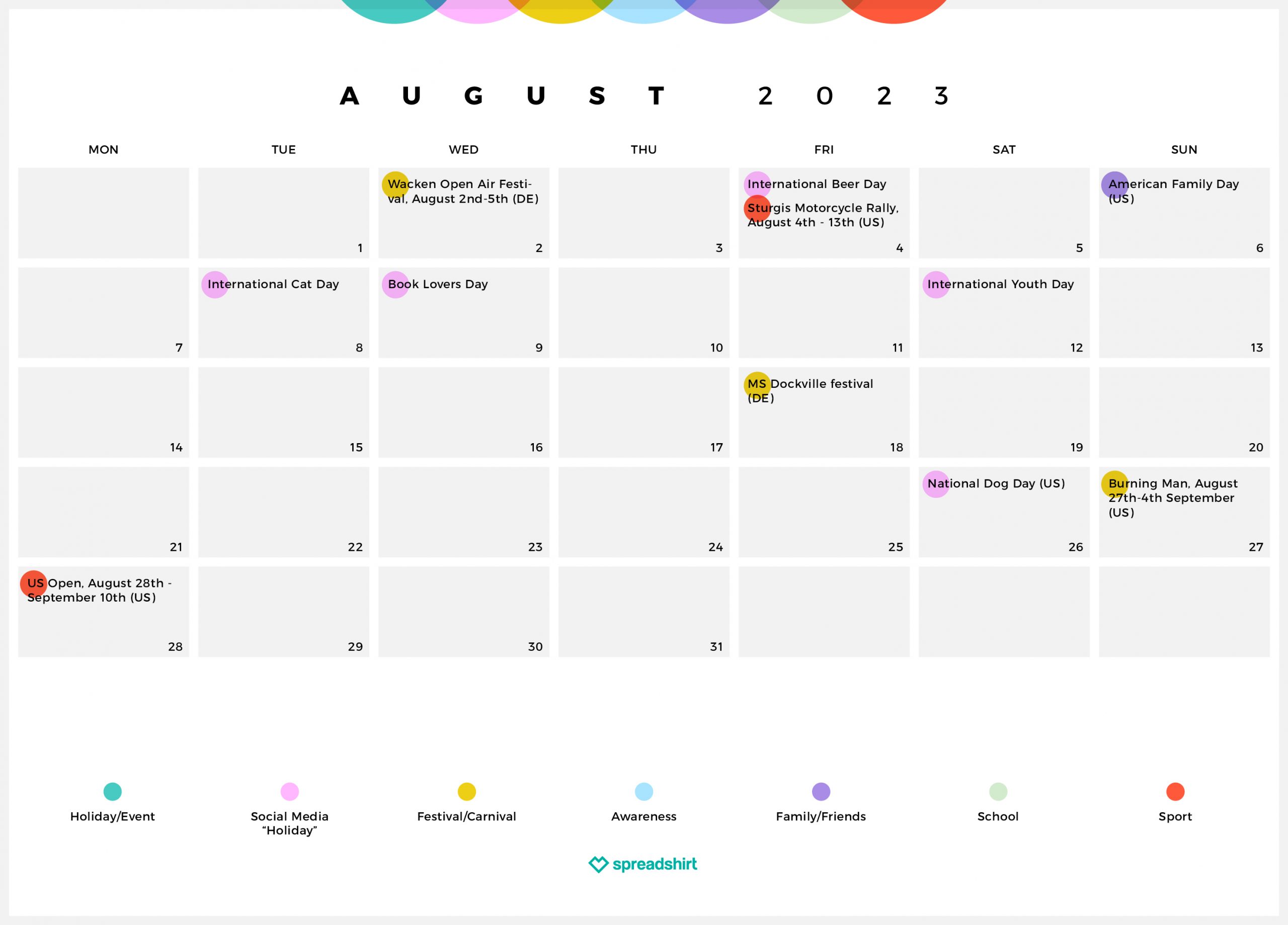

Want more inspiration? You’ll find everything you need in our articles on the Top Search Terms of July to September 2022 and Bestsellers of Q3 and Q4 2022.
Still have burning questions? We are there with the answers in the comments below or on the forum.
The post Most Important Occassions: July – September 2023 appeared first on The US Spreadshirt Blog.
Looking for cool gifts? Check Rott515 store!

Wikipedia’s Subtle Makeover: A Fresh Look After A Decade
Looking for cool gifts? Check Rott515 store!
Wikipedia is a widely recognized online encyclopedia known for its up-to-date information. The site attracts billions of monthly users looking for detailed information on any topic. Its formal appearance encourages visitors’ attention to the text. Now, Wikipedia has made some changes to the interface to make it more user-friendly.
The updated interface of Wikipedia has made it easily accessible by adding new features. The new features enable users easily navigate and access information. It is now much easier to search the site for information. The tool to switch between languages is visible now. Then, all the commonly used links are quickly accessible on the updated header. Many other Wikipedia redesign changes now make Wikipedia a more user-friendly and easily accessible site.
However, the site did not make radical changes. The site made some minor but crucial tweaks. The users notice these changes slowly. Still, according to the site, the updates were necessary to make it compatible with the new generation of users. The designers had internet users and first-time website users in mind while making the changes.
What Is Wikipedia’s Mission?
Wikipedia website was launched on January 15, 2001. Since then, it has registered tremendous growth in searches, number of users, languages, and pages. It has over a billion visitors monthly and sixty-one articles. The site publishes articles in more than 300 languages.
The website regularly creates and updates its content, so articles about new events instantly appear. Wikipedia is one site where anyone with internet access can change or write new articles. Only in a few cases, the site allows users to edit articles with its permission to prevent vandalism.
Anyone can visit the Wikipedia website and edit its content, references, and images. The site believes that content is essential no matter who writes it. However, the articles written or edited must align with Wikipedia’s policies. These policies include verifiable content and published sources. Personal opinions, beliefs, and experiences do not matter here.
So, it is a popular website with users regularly visiting it to get updated information on any issue. The site also has stated its purpose clearly.
Wikipedia’s mission is “to create and distribute a free encyclopedia of the highest possible quality to every single person on the planet in their own language ….It is also the goal of the Wikipedia community: to build and distribute the best encyclopedia that we can. This is a crucial role Wikipedians are fulfilling in the world. So, when editors get bogged down in a conflict while editing Wikipedia, it might help to think about another quote by Jimbo (from the same interview as the initial quote above)”.
Why Has Wikipedia Made Changes To Its Website Design?
Wikipedia Foundation took the services of more than 30 volunteer groups from different fields to tweak the interface. These volunteers were from India, Indonesia, Argentina, Ghana, etc. They all were involved in testing the updates and gave their insights and feedback.
The intention behind the new Wikipedia design was to make the website compatible with modern internet users’ requirements. It also aimed at making the site look simple by removing the clutter. The foundation also wanted users to contribute easily due to the updated interface.
Also, the foundation wanted to make the desktop and mobile versions of the site consistent.
Looking For a Website Design?
We have helped thousands of business owners from all around the world with their graphic design needs such as a logo design, website design, social media posts, banner and much more.
Get Your Website Design
What Are The Significant Changes Made?
The changes Wikipedia made to its website are not instantly visible to regular users. But when you start using the site, you notice them. So, here are the changes:
Improved Search Box
Wikipedia now has a new search box with different search features. The search box lets visitors use descriptions and images in the site’s autocomplete suggestions. The suggestions automatically appear as the user types in the search box. This way, the search box can direct the users to the article they are seeking.
This might be a small and unnoticeable change, but it helps speed up the searches. According to Wikipedia Foundation, this minor change alone had led to a significant 30% increase in user searches when tested.
Header Made Sticky
The header is now sticky. It remains visible even when you scroll down the page to the end. An advantage of the sticky header is that you can still see the links, such as the Page name, Search, and Sections while scrolling. It stays pinned and visible at the top of the page, helping users read or edit the text.
Wikipedia Foundation noticed that this minor change saved users time navigating between different sections and pages during the testing phase.

Language-Switching Tools Relocated
A significant change is the location of the language-switching tools, which is crucial for this website. Visitors want to have the information in different languages. So, they should access this tool easily.
The updated Wikipedia website now has the language-switching tools at the top right, where they are instantly noticeable. Since the top right corner is a prominent corner on a website page, users can quickly locate it to switch between hundreds of languages.
New Table Of The Content Section
The changes in Wikipedia’s new layout are also about how the table of contents appears on the website. Currently, the content table is on the articles’ left side so that users can easily navigate long-form content.
But now, the content table will still be visible as you scroll the page downward. So the users can know the section of the content while reading and scrolling down. The user can now smoothly move between an article’s different parts while reading it.
Recommended Reading:
Collapsible Sidebar
Another helpful Wikipedia change to its page design is the sidebar. It is now a collapsible sidebar. Now, the users can have a better reading experience since the sidebar is no longer distracting. Also, due to the removal of sidebars, the width of the content has increased. That has resulted in the shortening of the article length. The readers can only scroll down a little to access the entire long-form text.
But every page has a toggle allowing users to log in and out. The toggle is for users reading the text on a monitor of 1600 pixels or wider. Those users can use the toggle to increase the page width of their choice of page.
These are the significant changes Wikipedia made to its website, which have helped users. These changes aimed to make the site compatible with the new generation of internet users.
You should also look at your business website to check if you should update its layout, content, and visuals. Find out if its logo needs some redesigning to make it appealing to the modern target audience.
If your logo, which is your brand’s core identity, requires a redesign or you need a fresh logo design, then Designhill can help. This leading marketplace is your one platform to source all of your visual designs, including logos.
All you are supposed to do is to launch your logo design contest and get multiple logo ideas from designers from all nooks and corners of the world. You can then pick one logo idea to make it your brand identity.
You can even create a logo using the site’s logo maker, which generates many ideas based on your brief. Then, customize the logo further to suit your brand message and personality.
Wrapping Up
Wikipedia is a popular website where millions find helpful, updated information on all topics. The site has changed its layout and features to make them easily accessible and compatible with modern internet users. These changes are not immediately noticeable but are helpful.